MARKET ART + DESIGN
ART MARKET PRODUCTIONS
BRAND DEVELOPMENT
LOGO DESIGN
EXHIBITION DESIGN
ENVIRONMENTAL GRAPHIC DESIGN
PRINT LAYOUT
ANIMATION
__
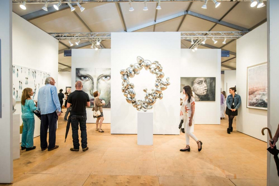
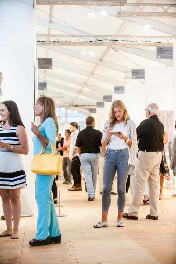
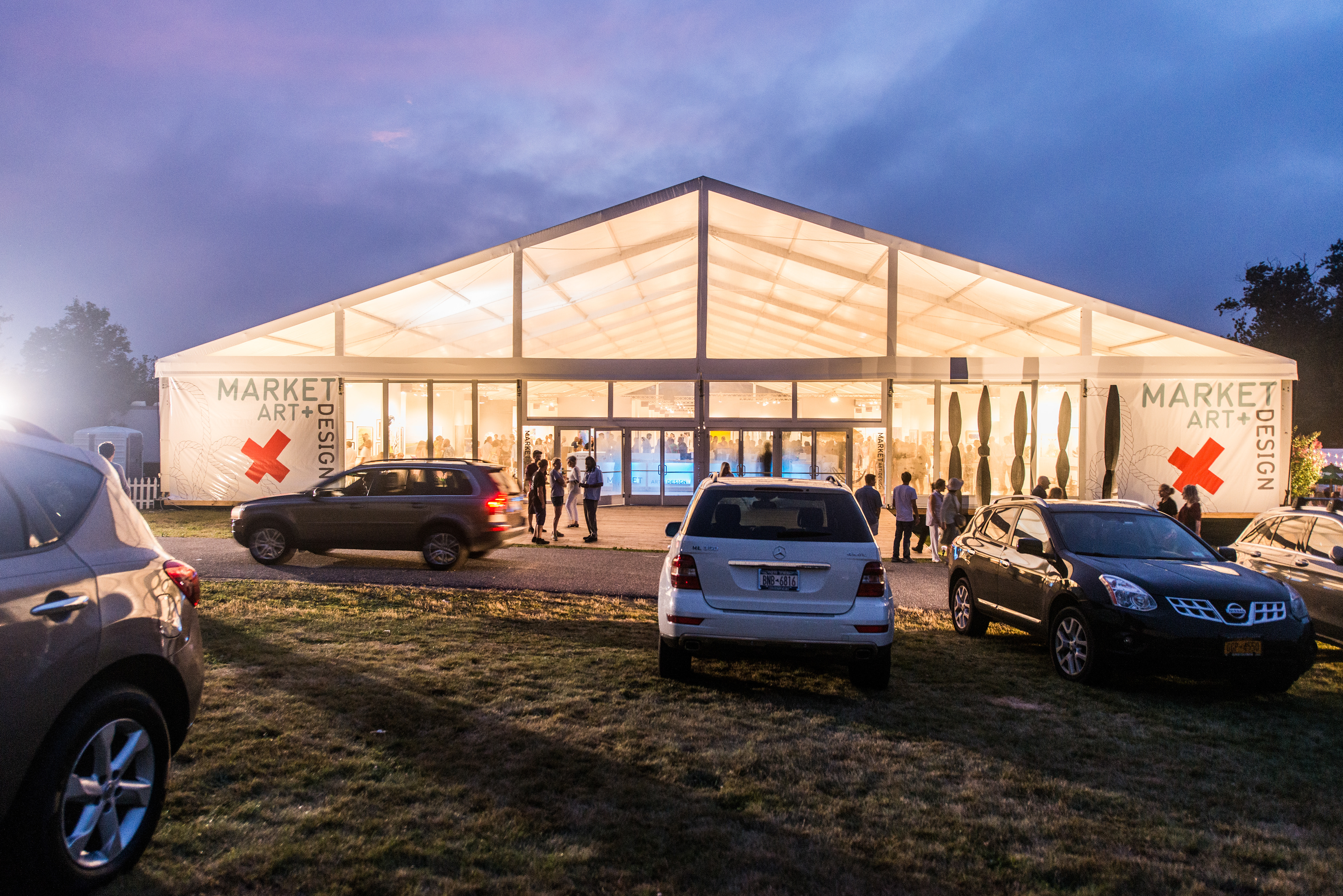
Market Art + Design is a beautiful contemporary and modern art fair that runs annually in the Hamptons. The Hamptons fairs tend to have a more casual, summery feel than other fairs and often show more decorative art. I chose "Rudder" by New York artist Jen Wink Hays as the centerpiece of the campaign, and other iterations of her gouache and pen work grace all aspects of the fair's brand, creating a unified feel.
MAAD always features a design component, and the 2016 edition presented a fine jewelry and furnishing section dubbed jewel box. This section of the fair featured its own branding, and I was able to work in tandem with the show's architect to create a physical space that reflected its unique identity yet flowed seamlessly into the other parts of the fair.
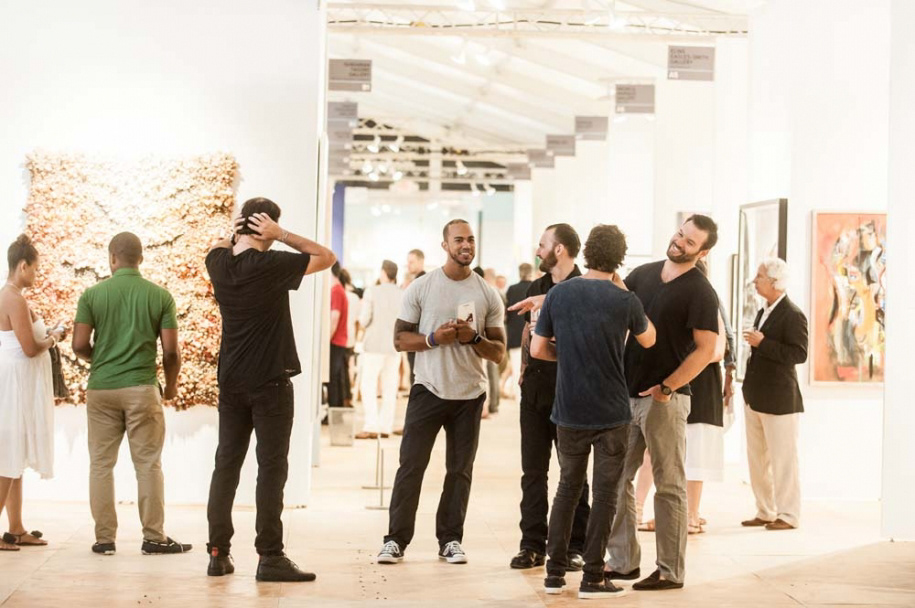
This edition of the fair was majorly successful, essentially knocking its two major competitors out of the market. As of 2017 it is the only art fair of it's size and prestige in the Hamptons.
OTHER PRESS: ARTNEWS / HAMPTONS MAGAZINE / BLOUINARTINFO / ARTNET / WOMAN AROUND TOWN / 27EAST / HAMPTONSARTHUB
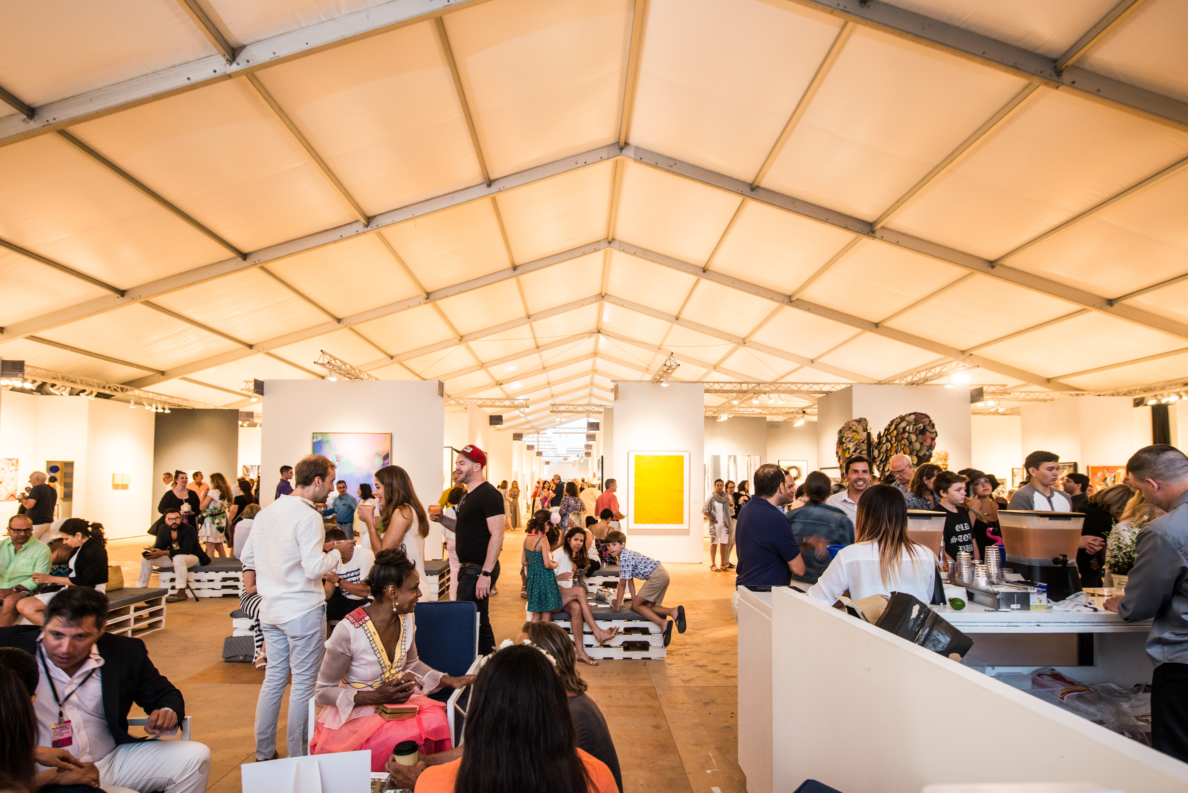
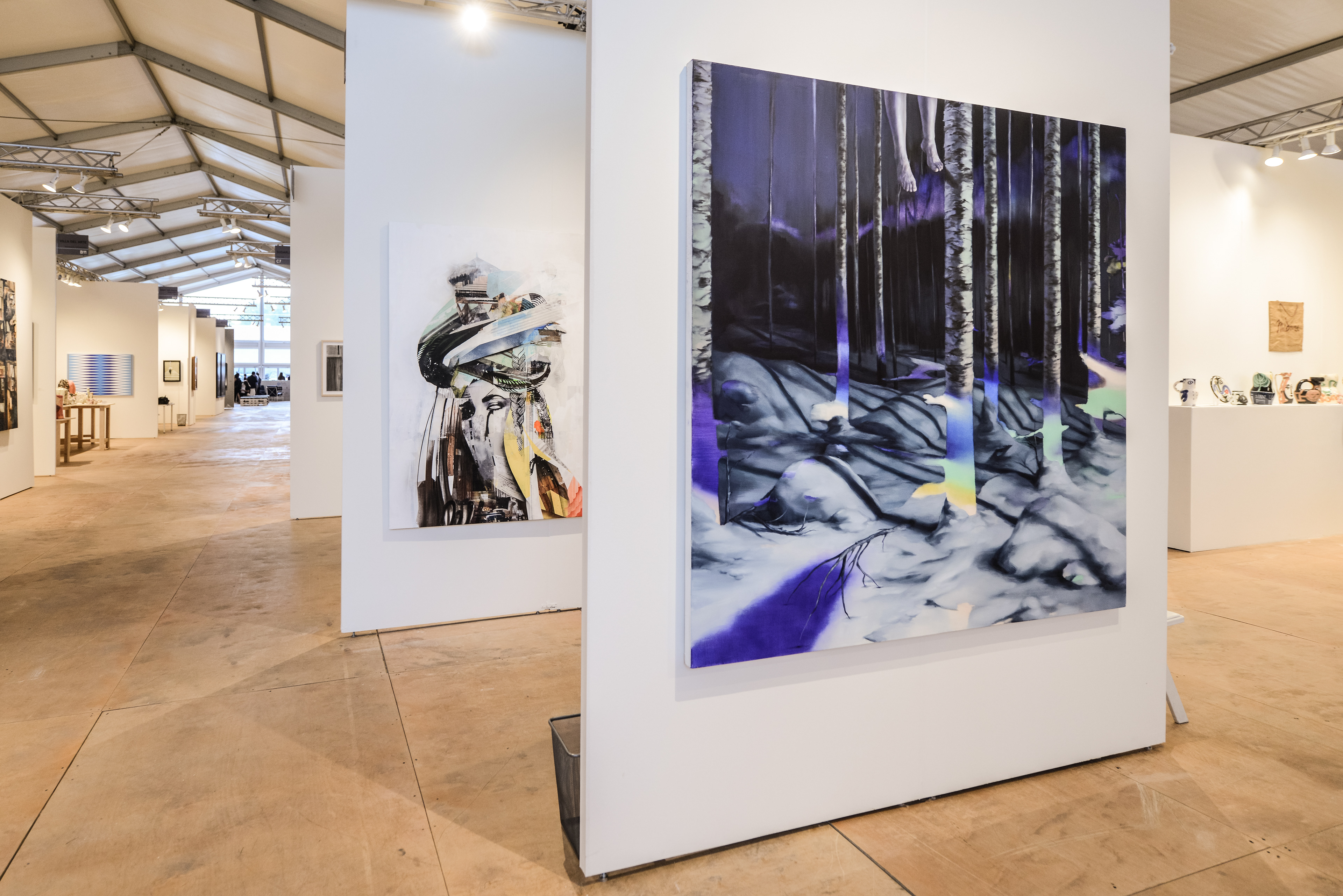
This was the first fair that I worked closely with the architect to integrate the physical spaces of the fair with the branding, which ended up being extremely successful. We kept an airy layout throughout everything and mixed high- and low-brow elements to make the fair feel luxurious but comfortable (and summery!).
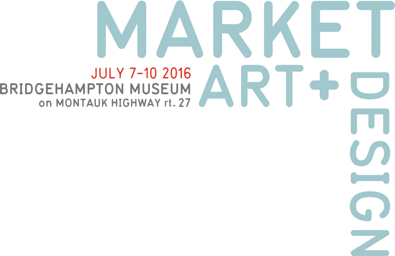
Logo progression. The original logo (left) still needed to be used on occasion, so I made it blue (each of the fair that Art Market produces has an assigned color, I changed MAAD's usual electric blue to this subtler hue) to better coordinate with the new workup.
The final workup was created to better frame exhibitor art and be extremely flexible for the different ways it would need to be presented. I was inspired by studying the corner joints on the back of a picture frame at a previous fair, and that interlocking of the wood really informed how the logo turned out.
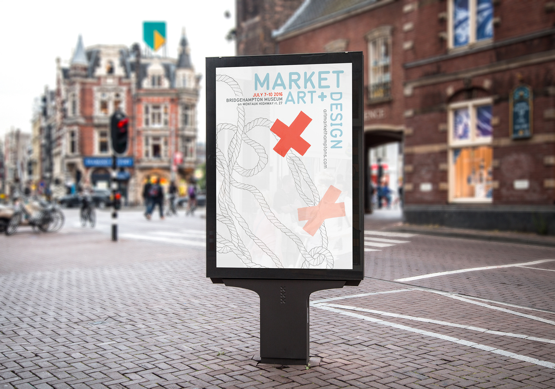
Advertisement featuring exhibitor artwork
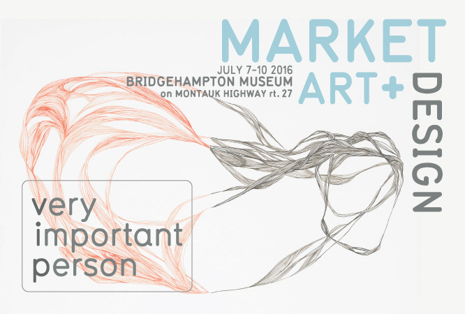
VIP mailer with attached VIP pass. This is another work by Jen Wink Hays, and was used to give the VIP program it's own sub-identity.
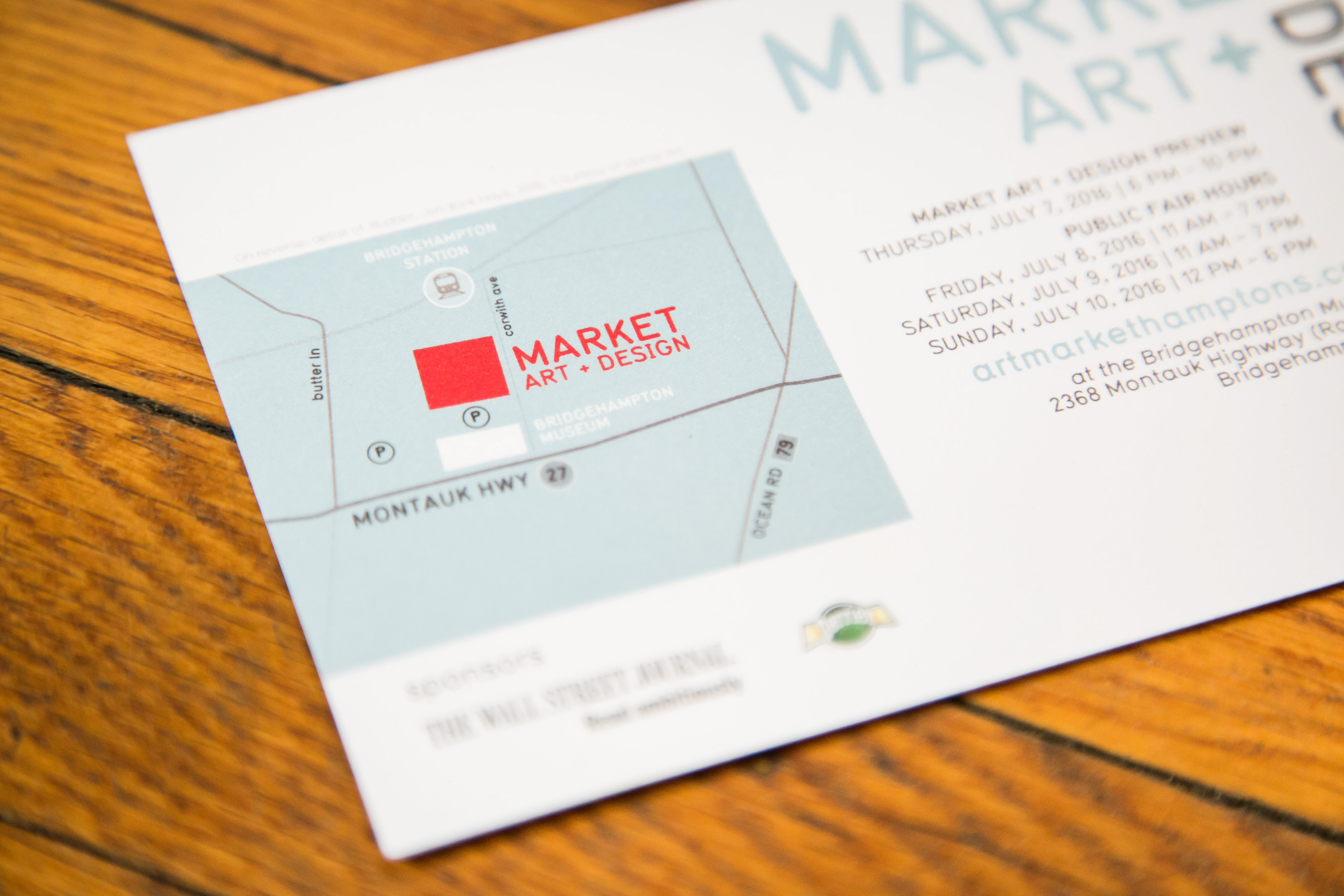
This is the back of a "gallery card", a postcard participating galleries could use to promote the fair.
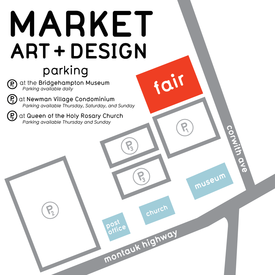
The parking situation was complicated, so an extremely clear map was necessary.
I source GIS data for all of my maps so they are always extremely accurate. I'm kind of nerdy about data.
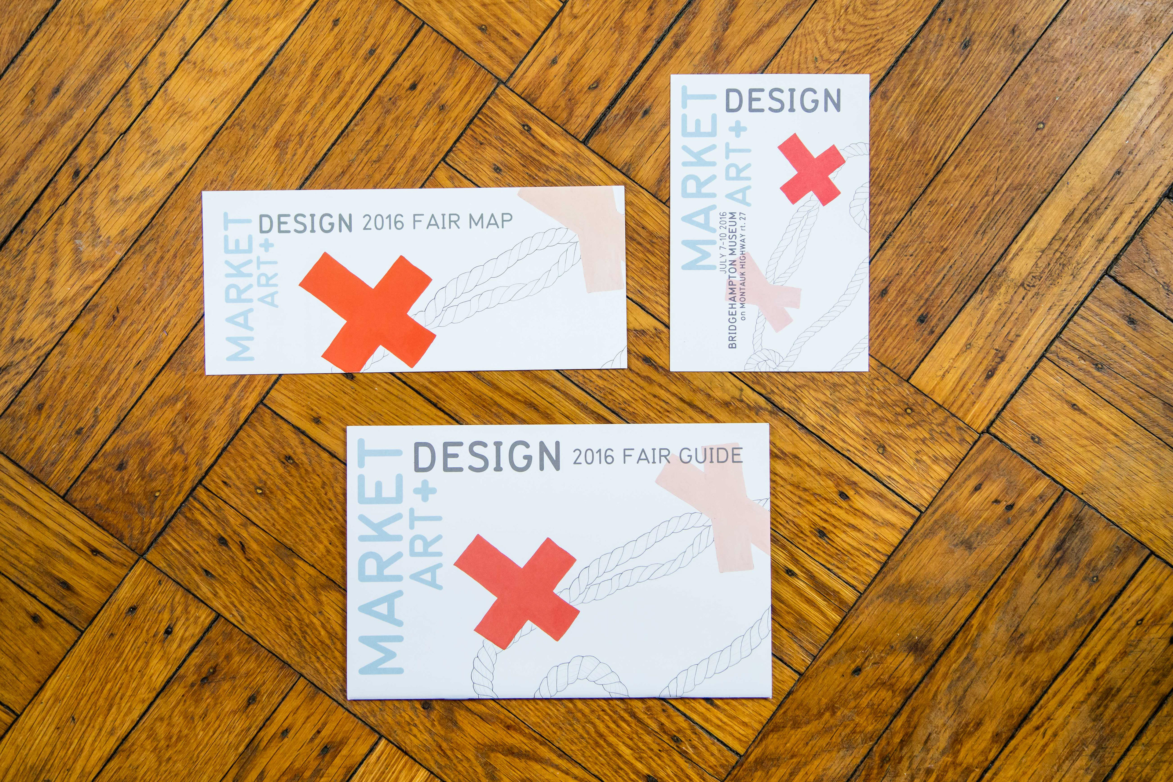
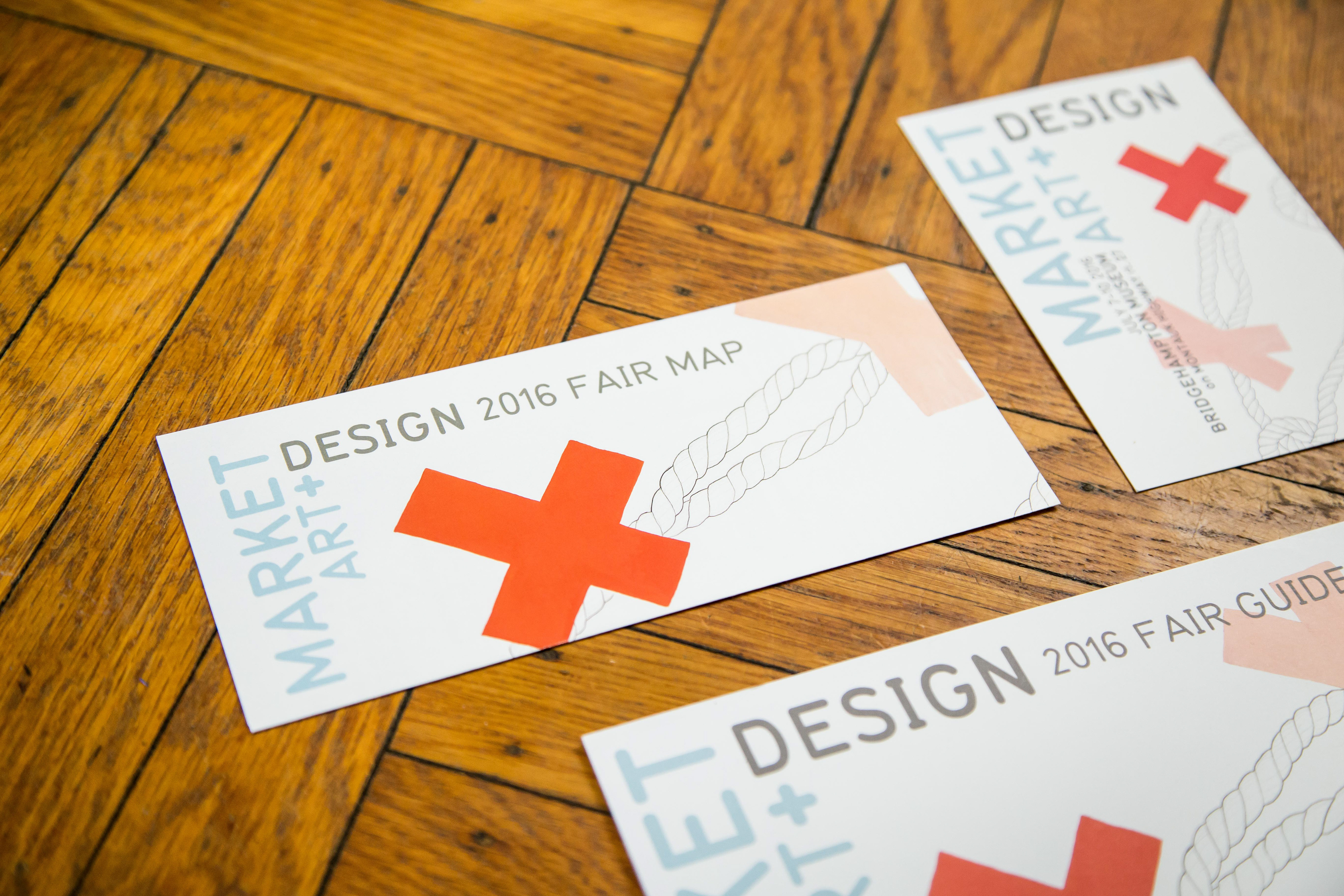
Trifold fair map, front of gallery card, fair guidebook.
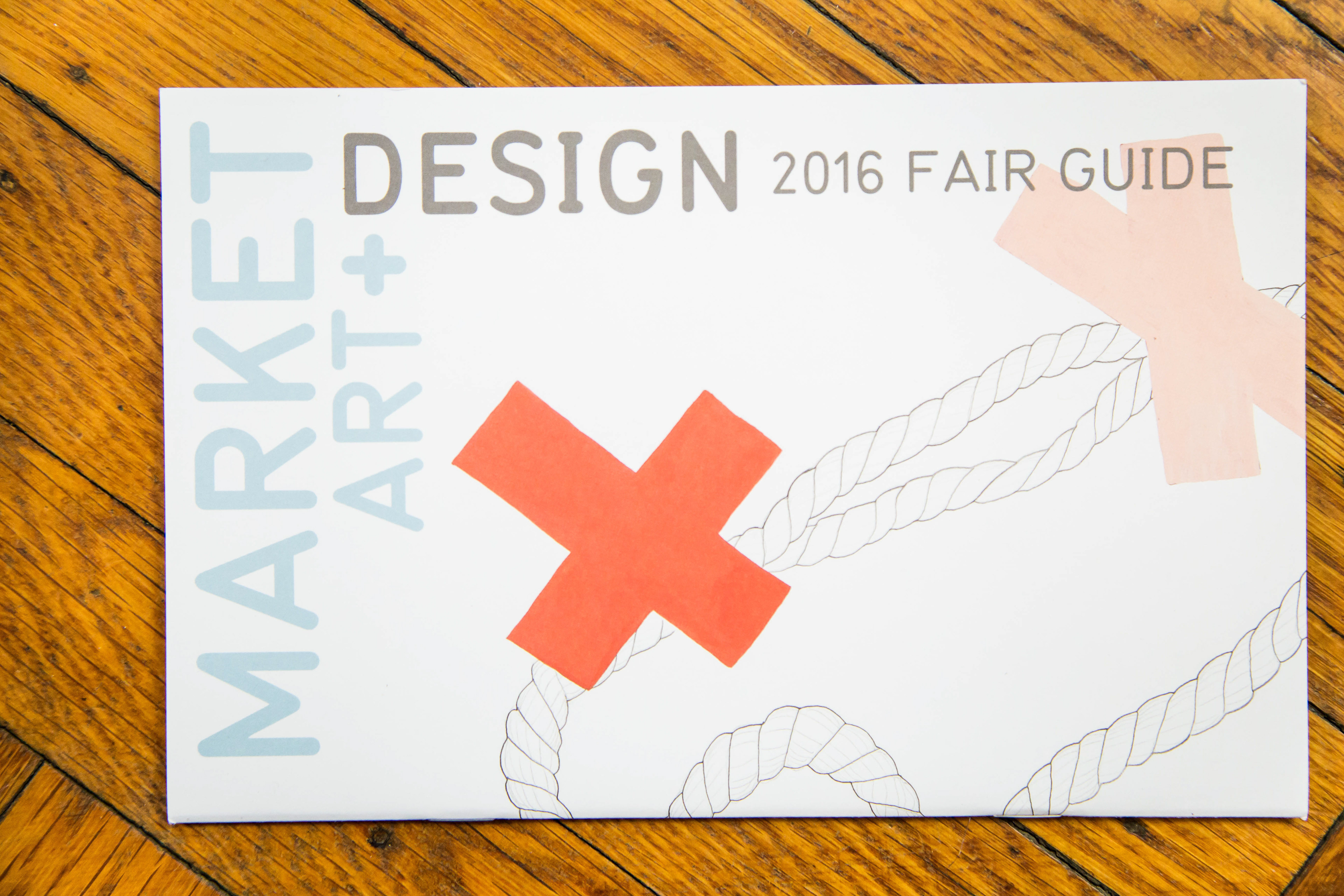
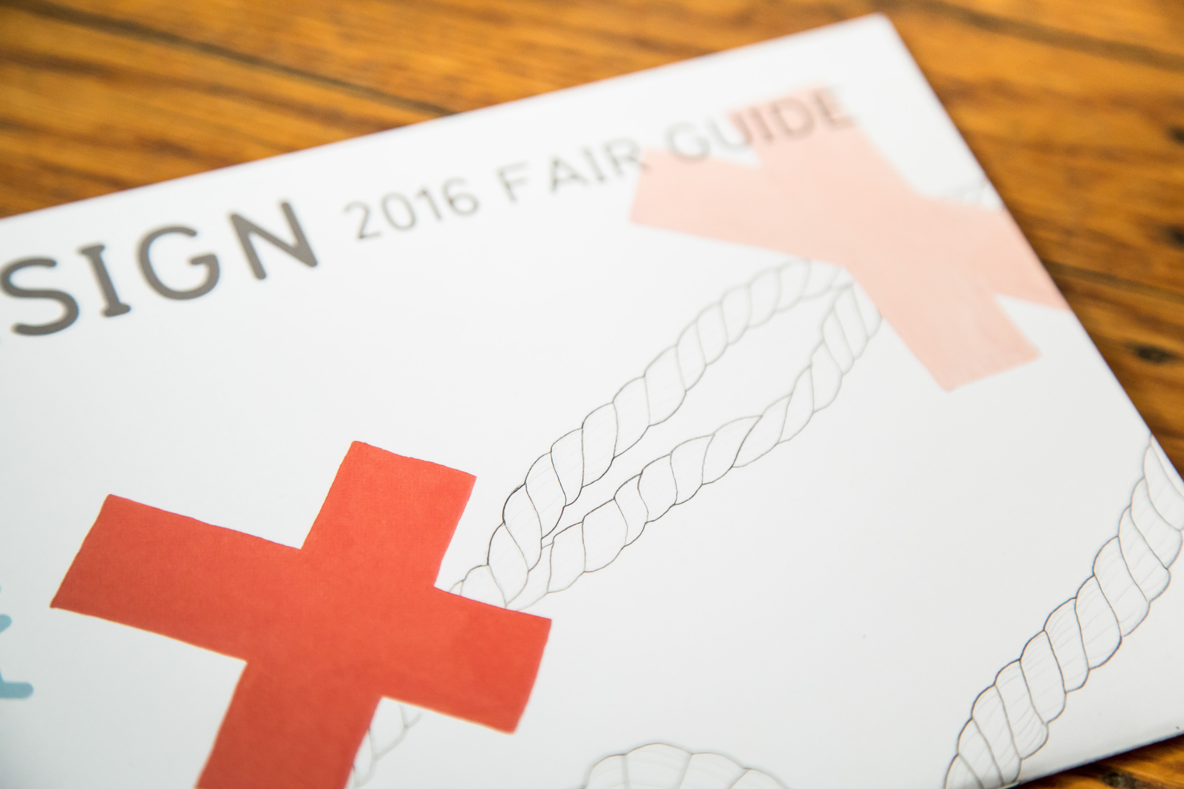
I printed the fair guide on a thick matte stock to give it a luxurious feel.
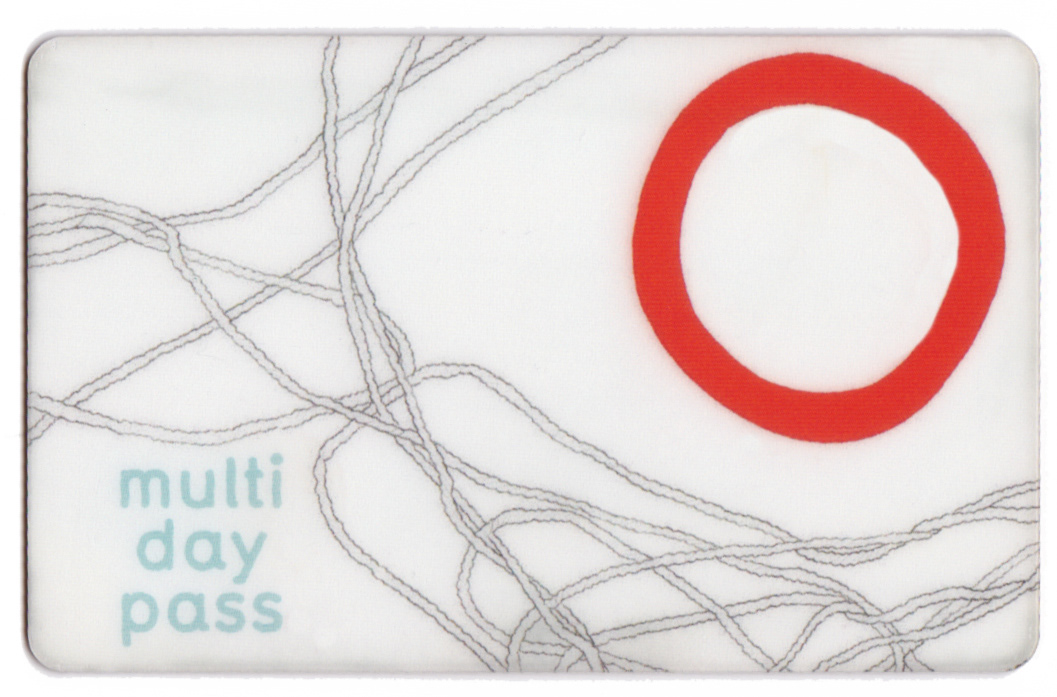
One of the types of fair passes, featuring more art by Wink Hays. Each type of entry was given it's own artwork, but they were from the same series so they felt unified. This was a pretty small fair so that was important.
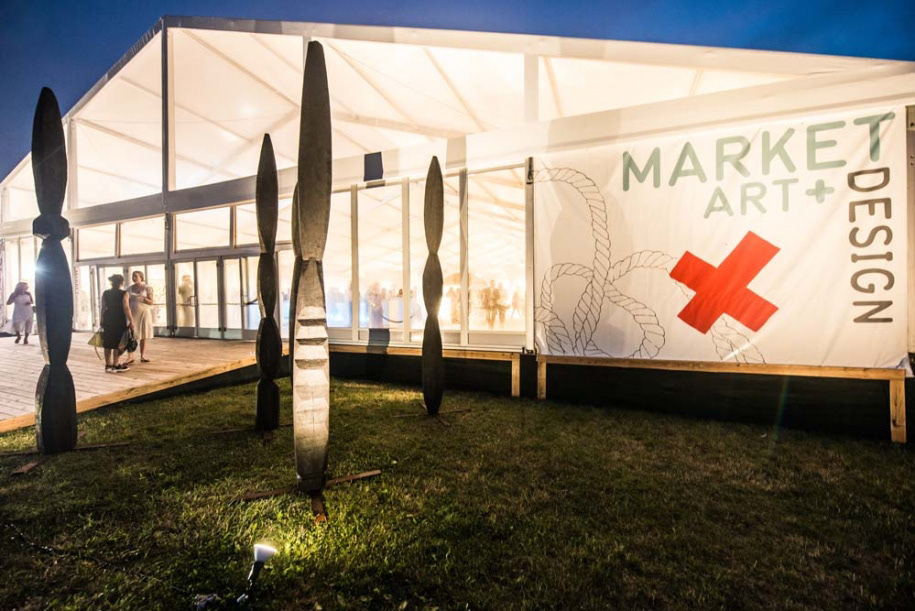
Tent panel sign at the front entrance of the fair.
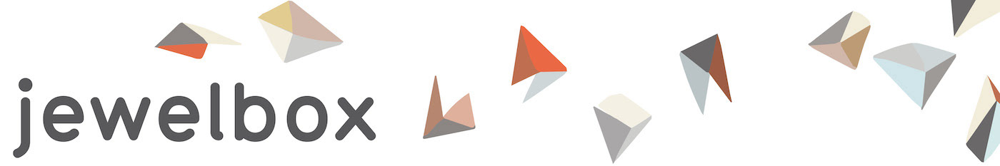
The fair's design component this year was "jewel box", a section of fine jewelers from around the world presenting high-end pieces. Luckily for us, Jen Wink Hays had also created a similar series of paintings featuring these gem-like faceted objects, which were a natural way to create a separate sub-brand that felt united with the rest of the fair.
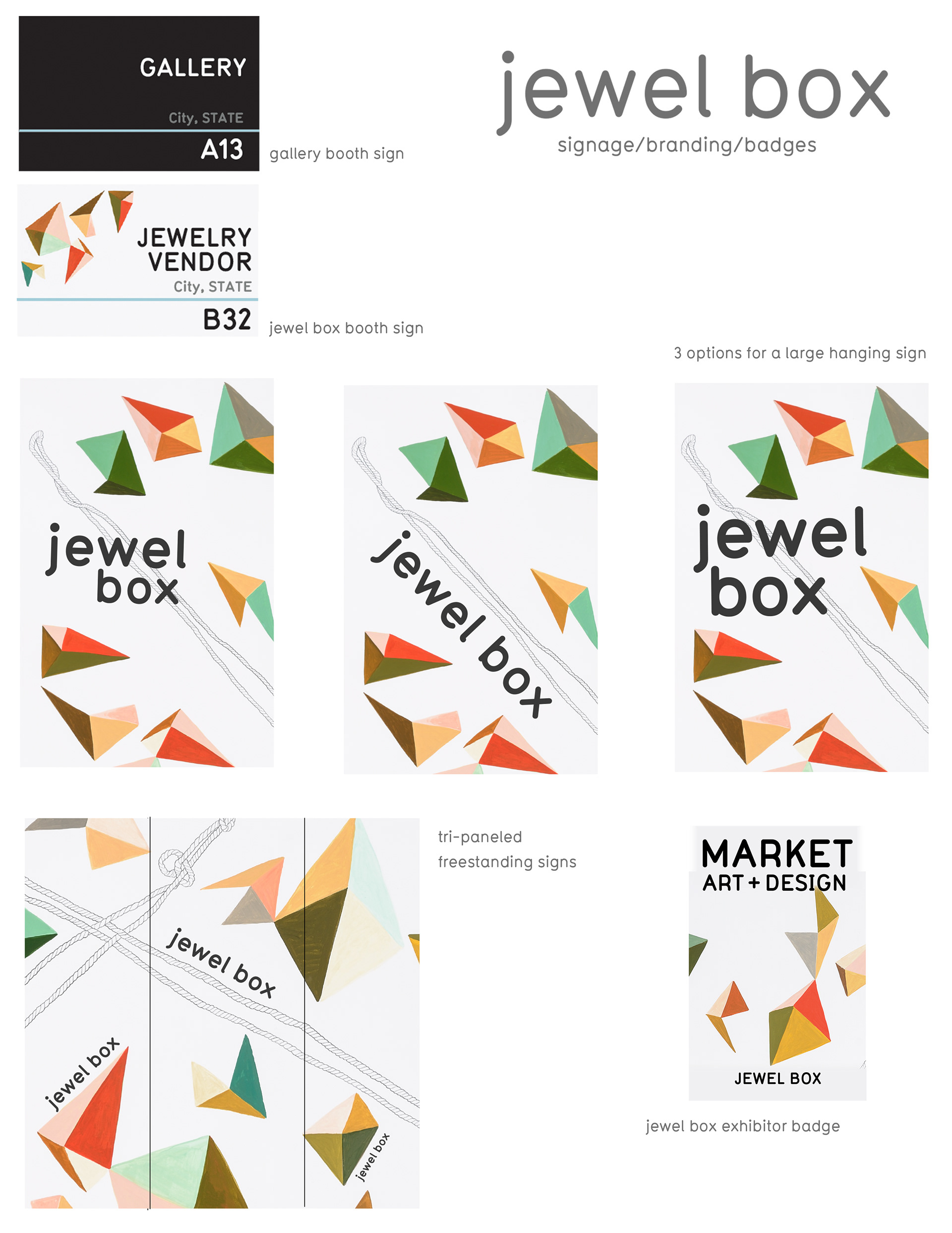
Above is my original proposal for assets. This was the first year of jewel box so it was very important to establish its identity, so exhibitors there received unique badges, signage, and custom paint.
I did a lot of fun stuff for social media outreach. This animated ad is my favorite!
Architect: Michael Pigozzi
Production: ART MARKET PRODUCTIONS + DYNAMIC EVENTS OF DENVER
Senior Producer / Curator of Installations: Lindsey Van Nuil
Exhibitor Relations Manager: Elizabeth Anderson
Production Coordinator: Camila Jones
Fair photos by Teddy Wolff / Asset photos by Briana Balducci