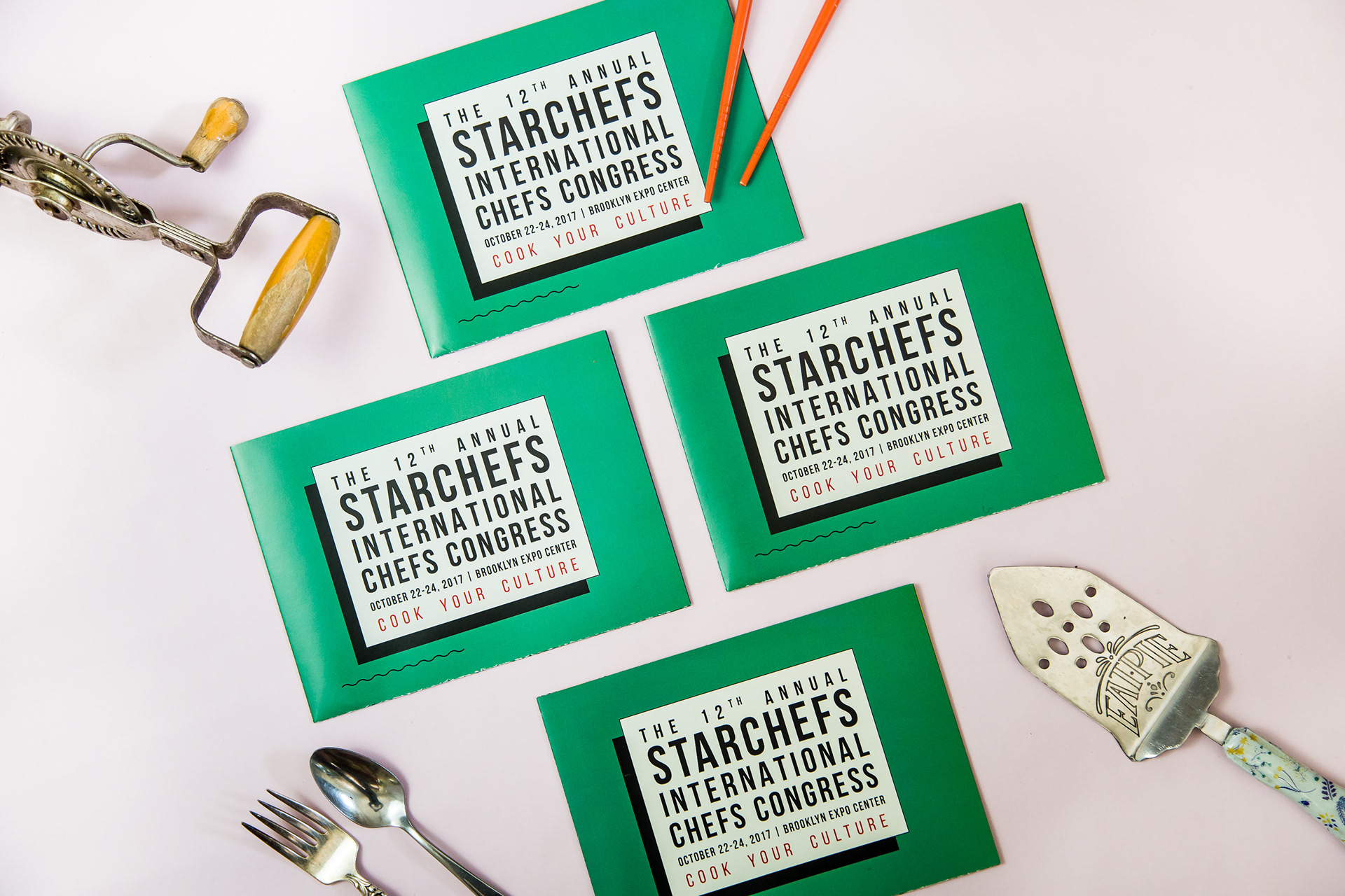
12TH ANNUAL
INTERNATIONAL CHEFS CONGRESS:
COOK YOUR CULTURE
EVENT BRANDING + VISUAL IDENTITY
PRINT ASSET DESIGN
ILLUSTRATION
ART DIRECTION + DESIGN OF 300 PAGE COOKBOOK & CONGRESS GUIDE
----
The International Chefs Congress is widely considered the most crucial meeting of restaurant professionals in the US, hosted annually by publisher and culinary community incubator StarChefs in New York City. This year's theme, "Cook Your Culture", celebrates America's rich immigrant food culture and the individual histories and experiences that make today's cooks. The Congress featured events like "Bad Hombres y Mujeres", "Mofongo Master Class", "Cultural Appropriation in Food", and "All in the Family", where chefs prepared dishes based on family recipes.
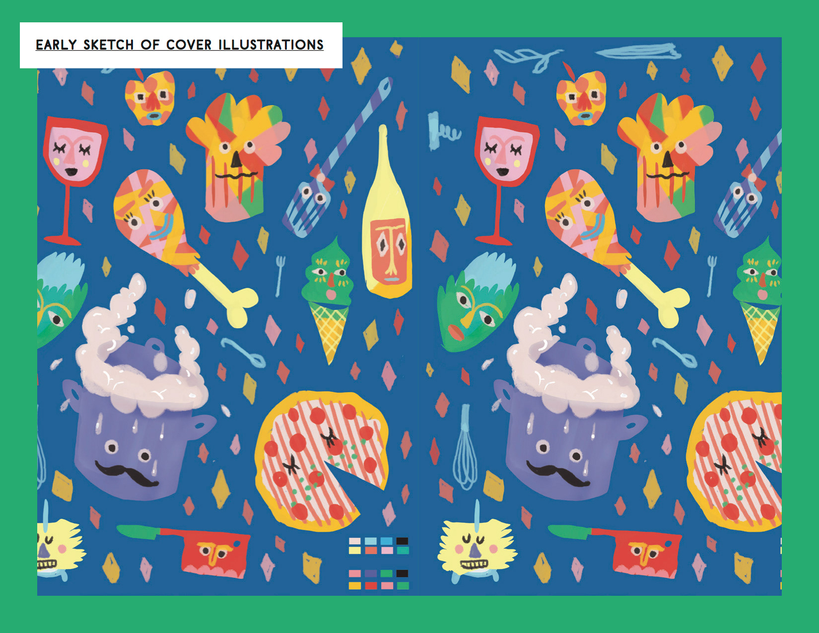
It was crucial that the diversity and vibrancy of the chefs and dishes took center stage and above all that the presentation not take itself too seriously. I created a playful identity saturated in vibrant colors and naive, folk art-inspired illustrations grounded with a sleek and clean type and layout system.

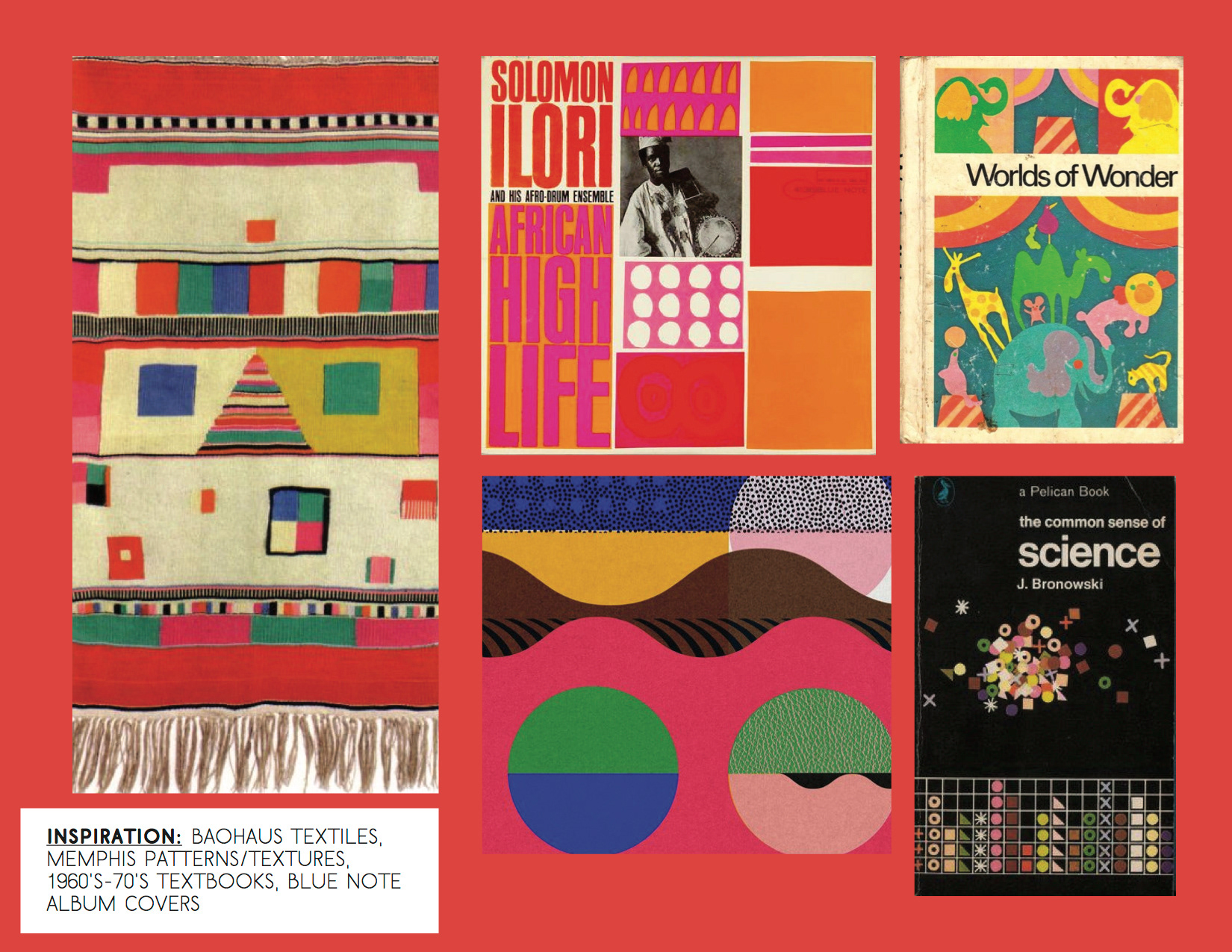
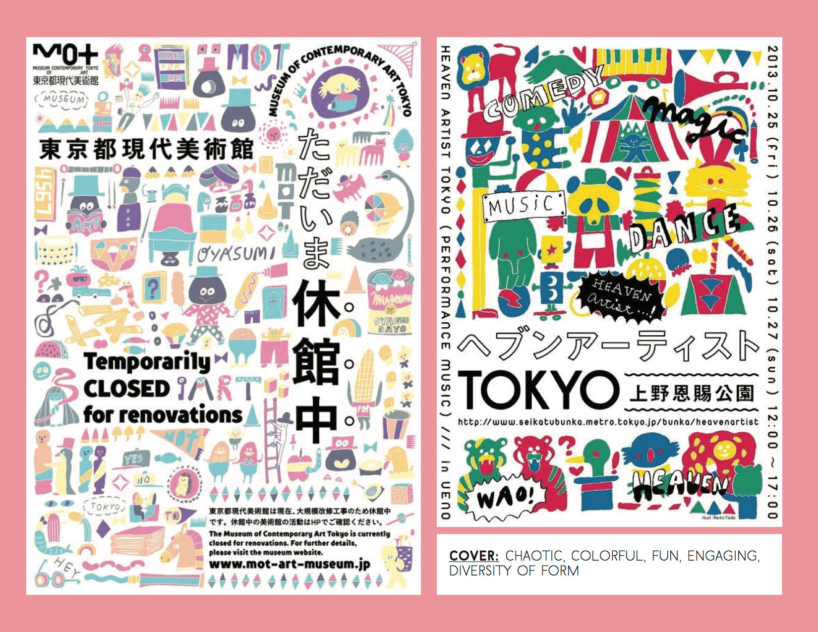
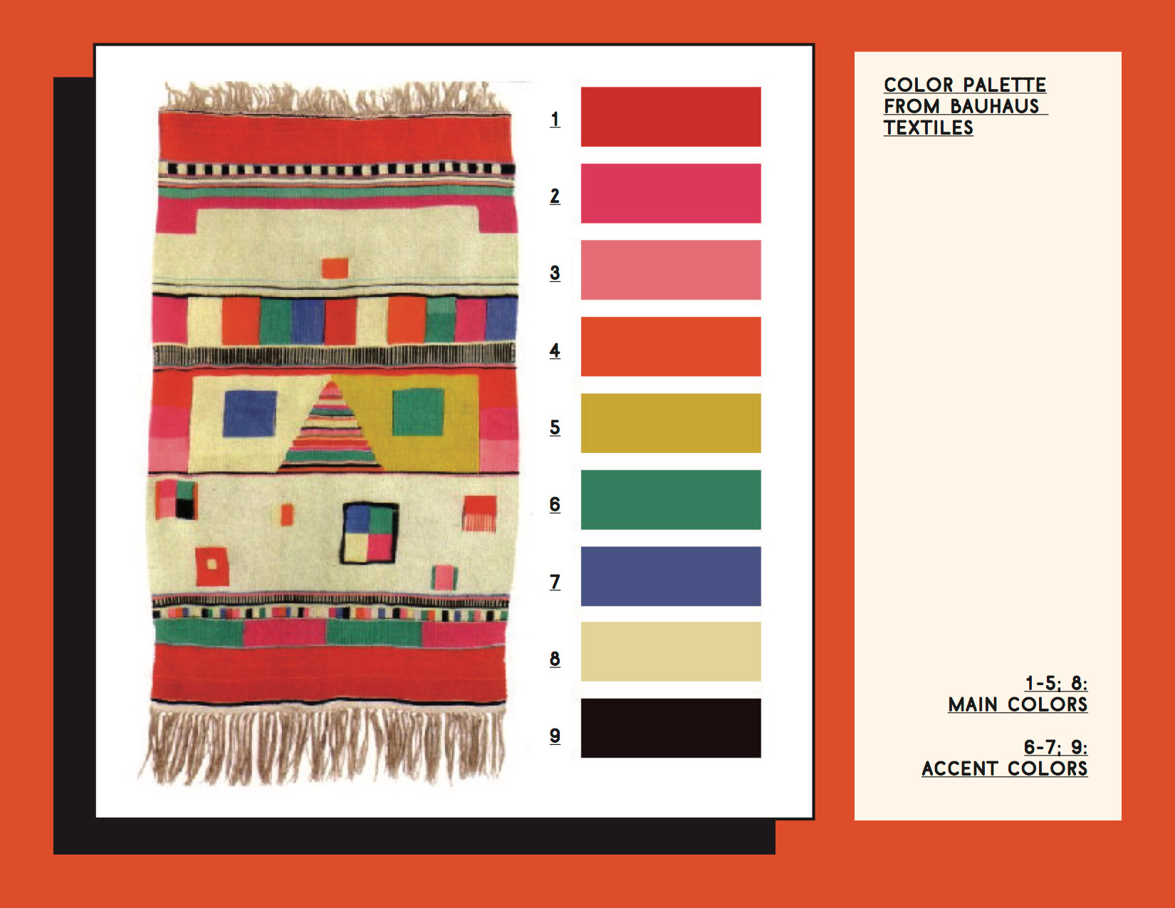
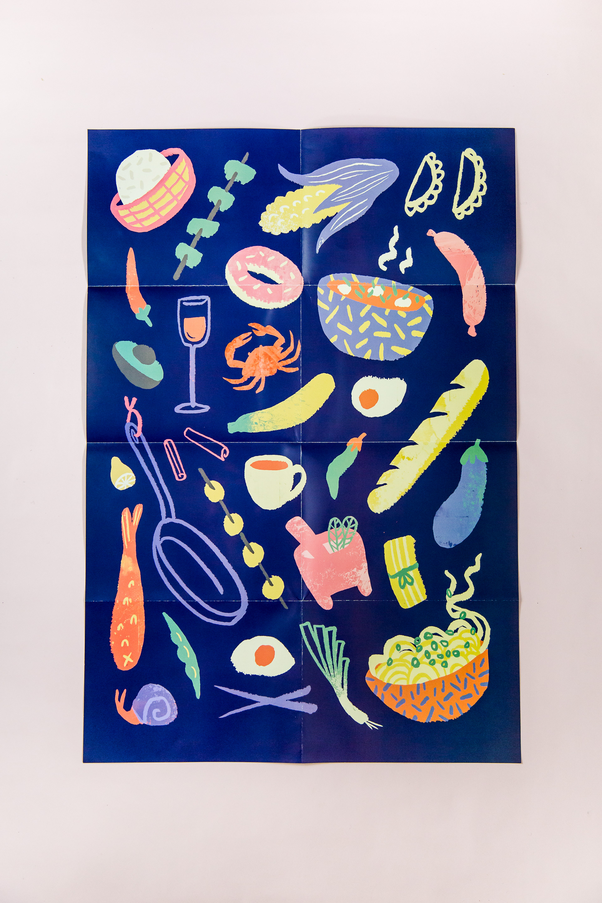
Slides from concept presentations with early stage illustration concept. I took inspiration from across the globe, pulling a color palette from Bauhaus textiles and the chaotic illustration layout from modern Japanese posters.
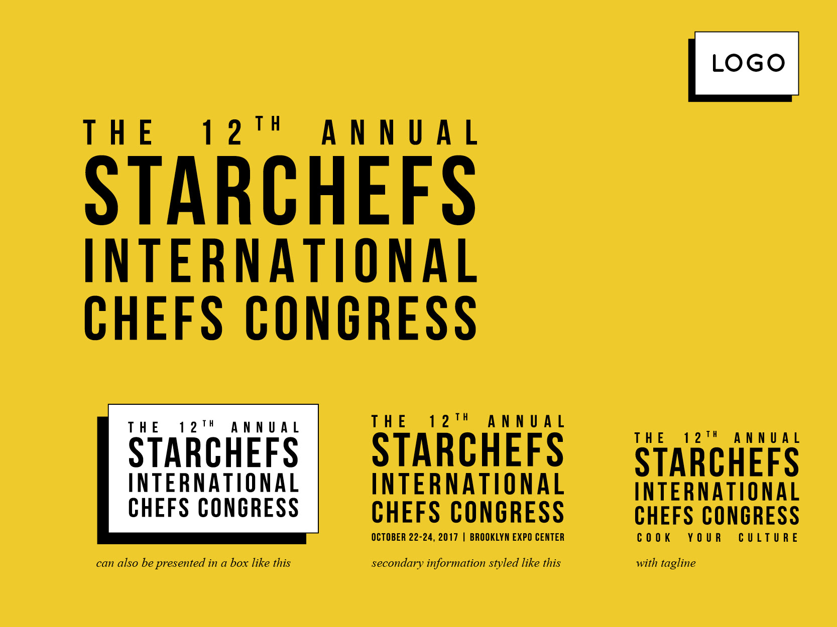
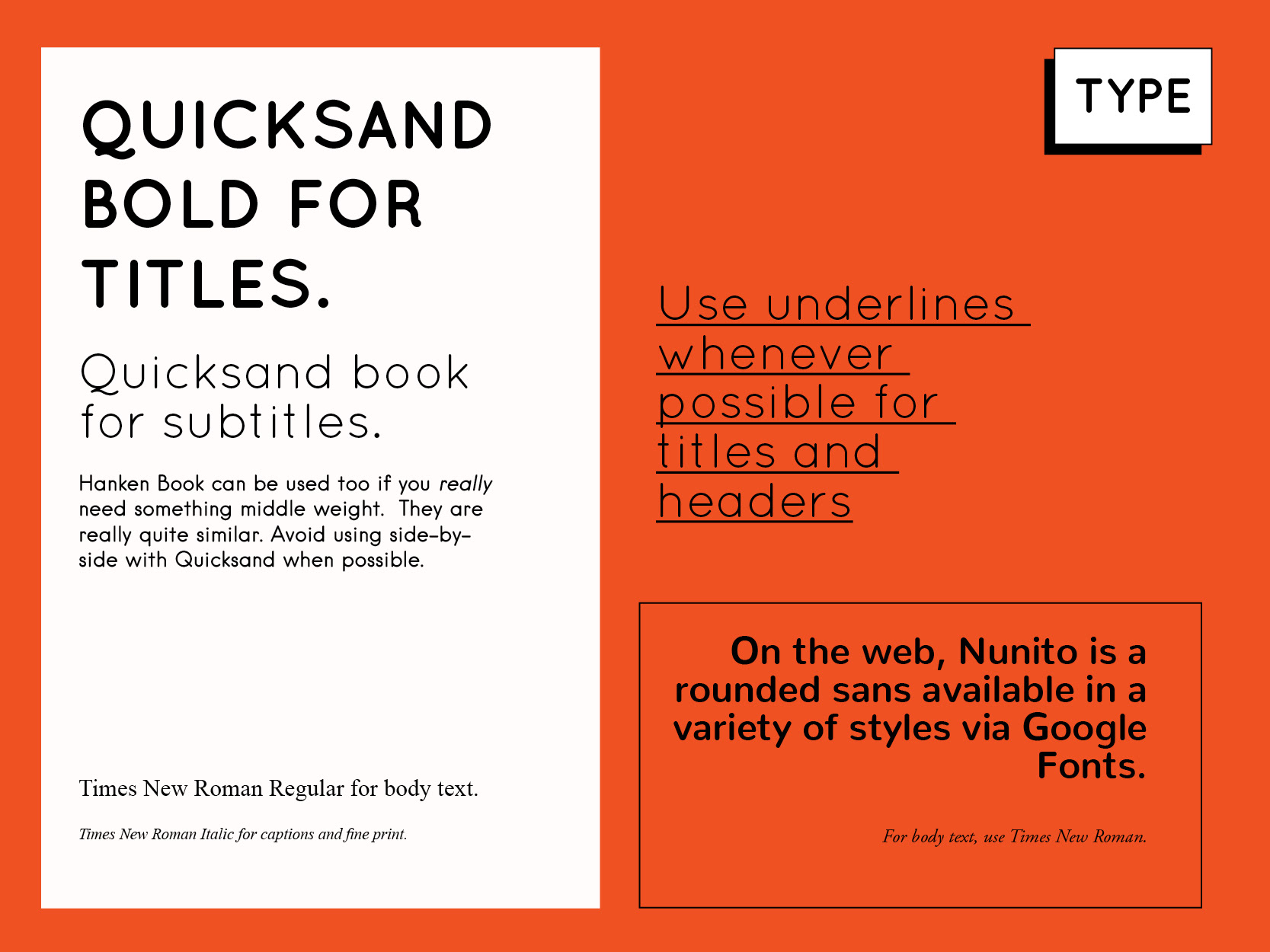
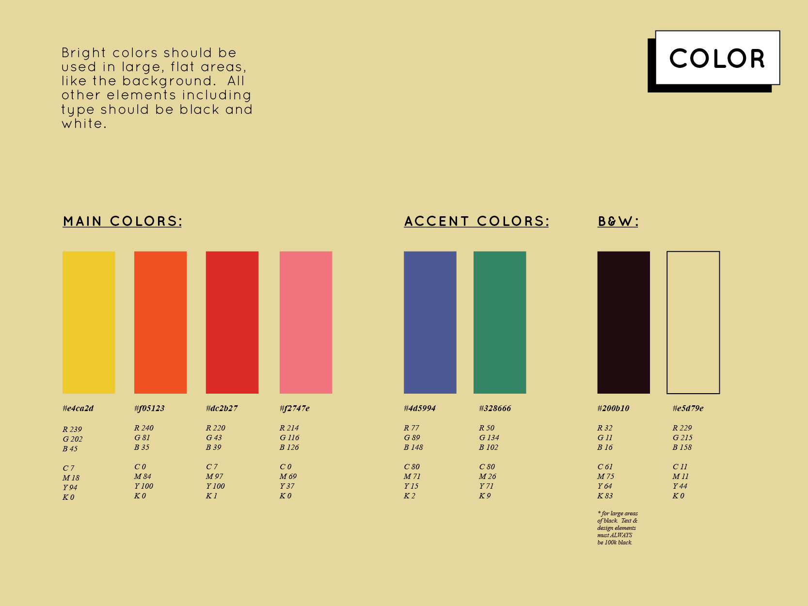
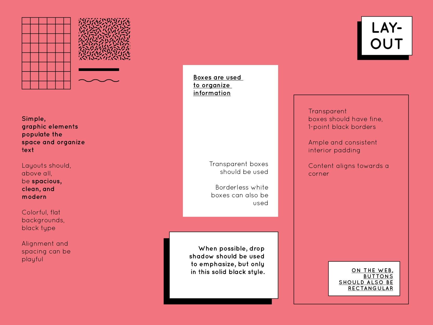
Pages from style guide. This branding has stronger rules than other systems I've built; I wanted it to be super structured and cohesive to balance out all the crazy colors and be recognizable when presented without the illustrations.
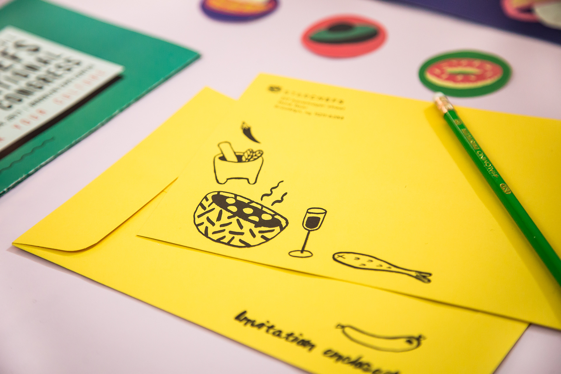
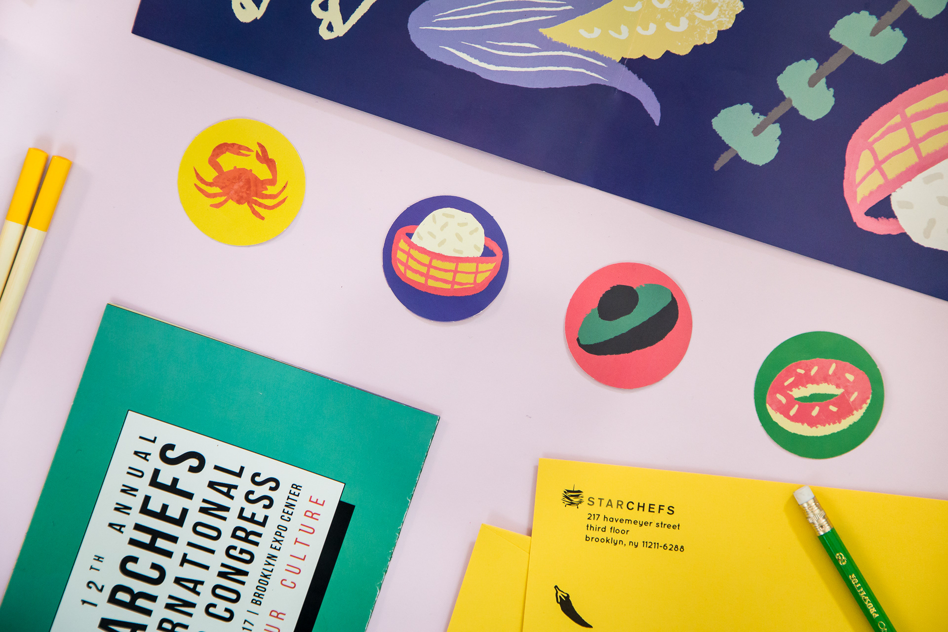
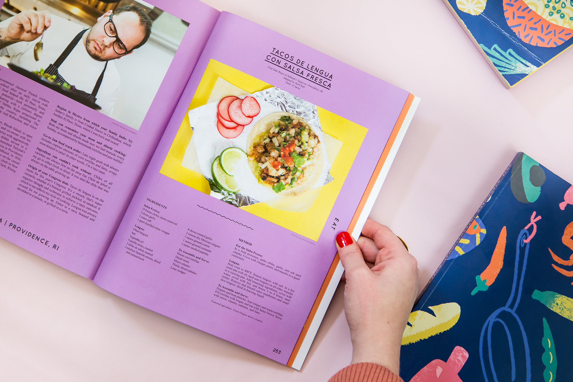
Clockwise: The ICC mailed invitation folded out in to a beautiful poster; Envelopes for correspondence with VIPs; VIP stationary, the mailed invitations folded up; the ICC cookbook.
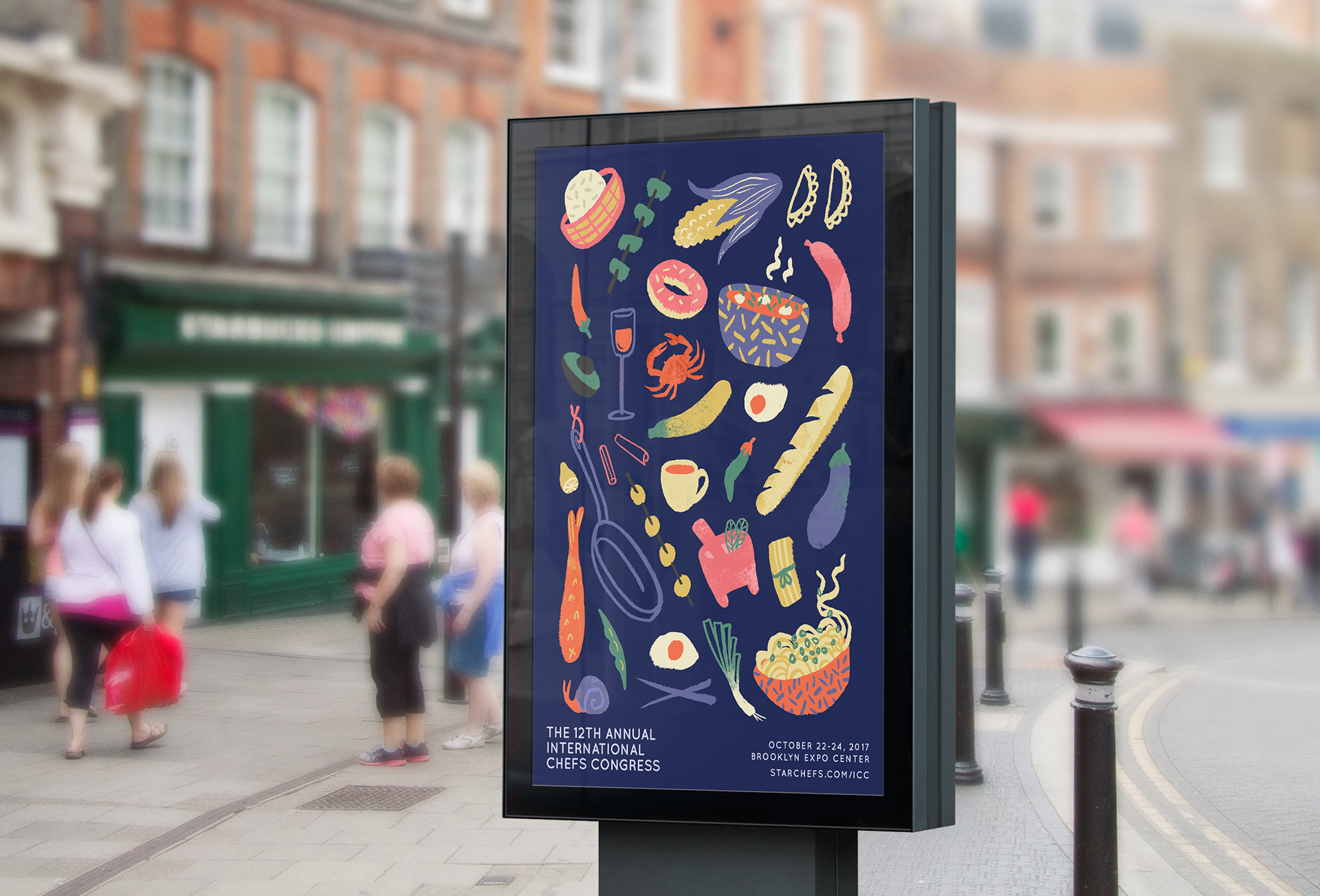
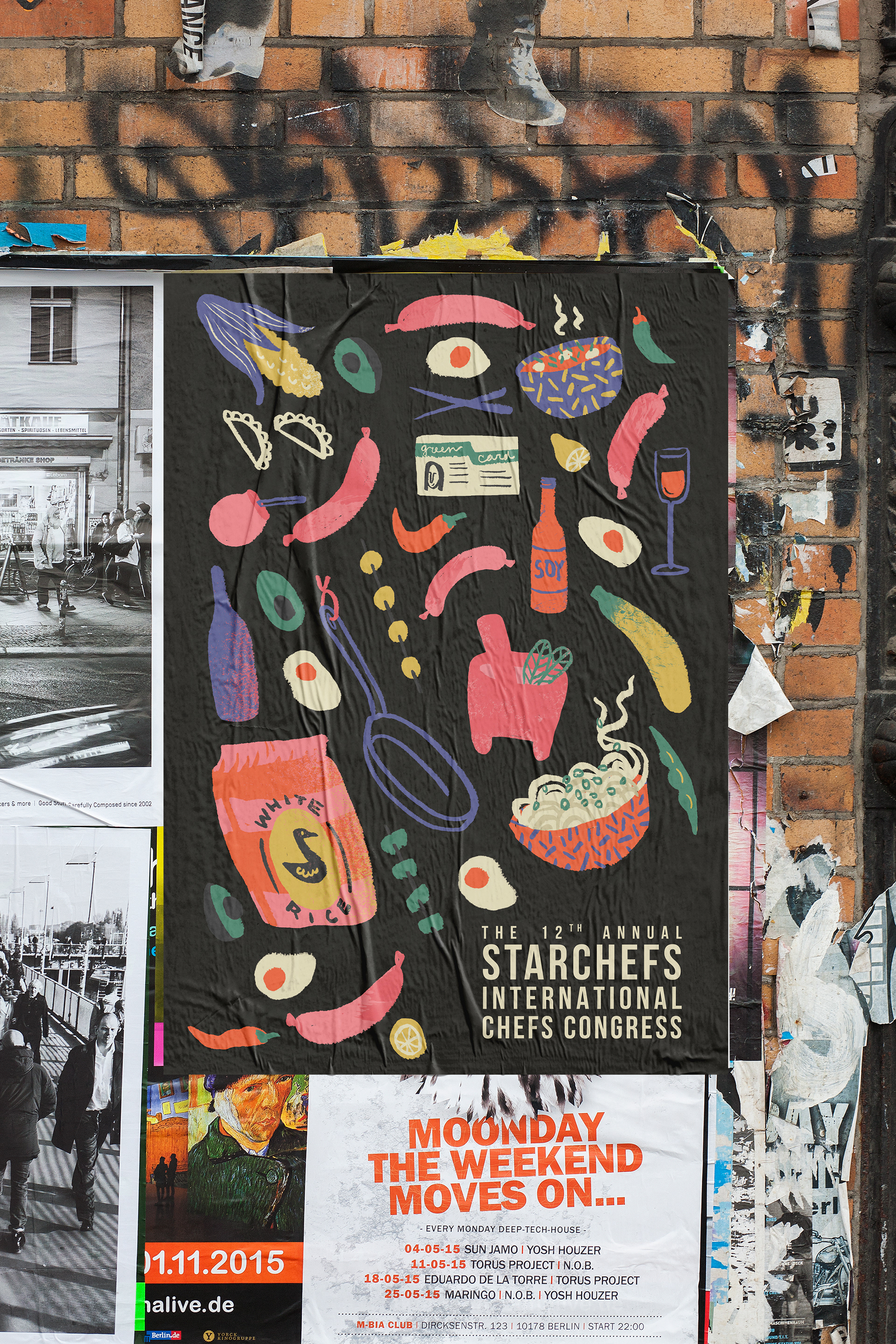
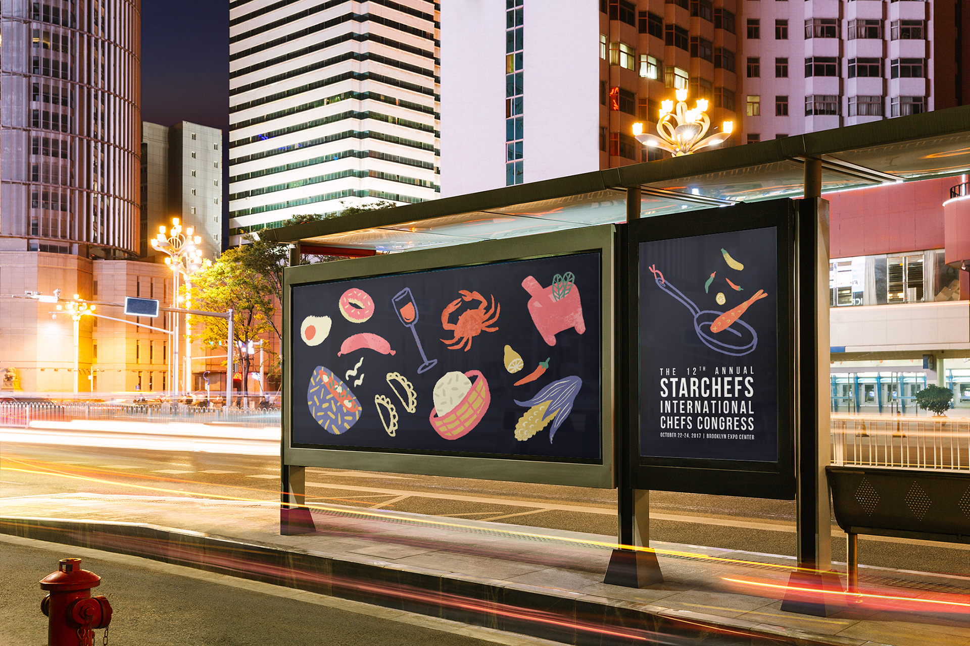
Advertising.
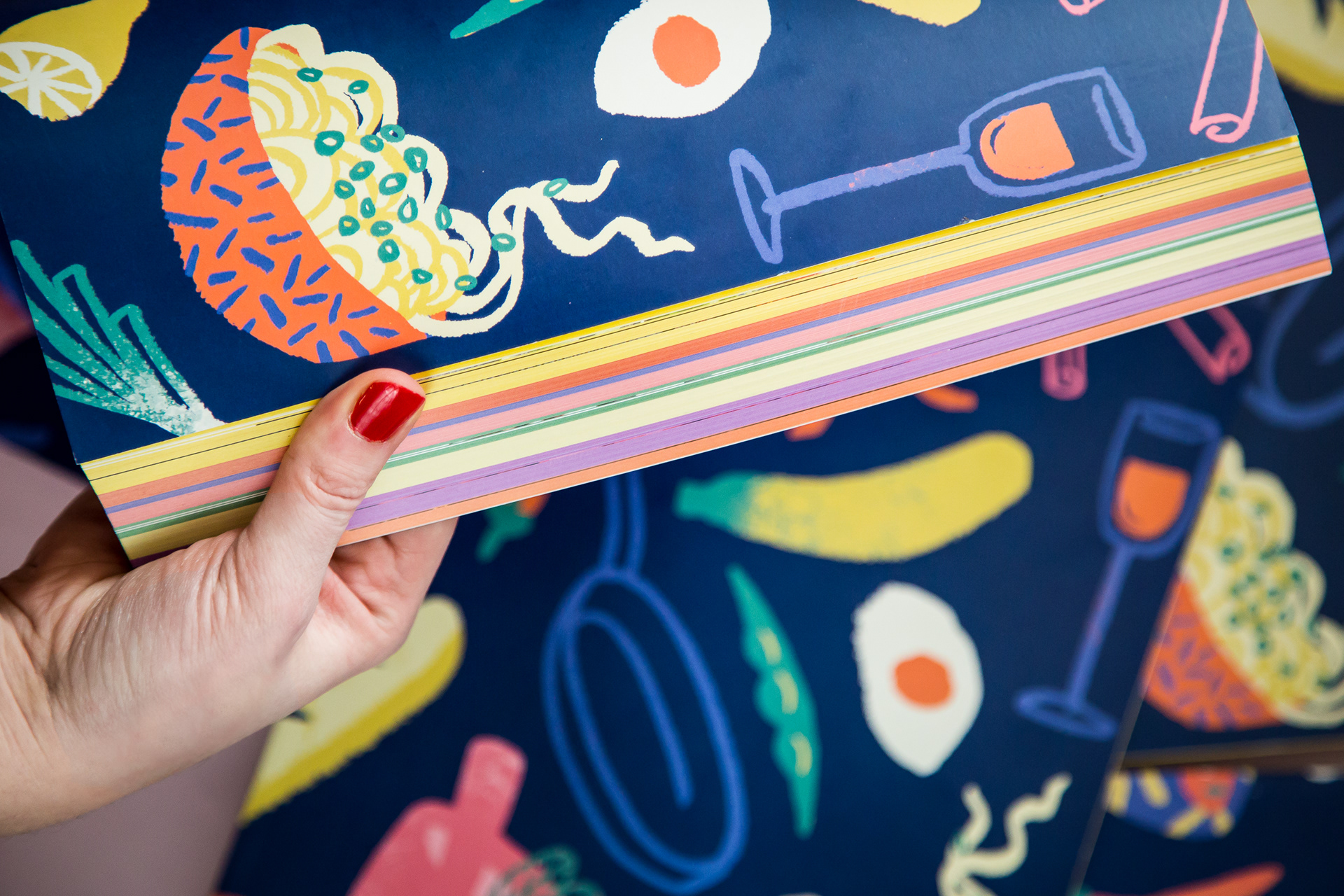
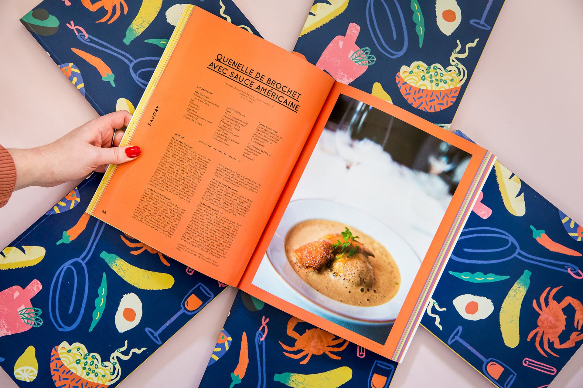
The annual cookbook is the largest asset produced for the event. Past editions had been a little sterile; I wanted to do a 180 and cram this edition with colorful spreads, illustration, and big, gorgeous photos. A spacious, super clean layout system allowed for this controlled chaos without feeling cluttered or overwhelming.
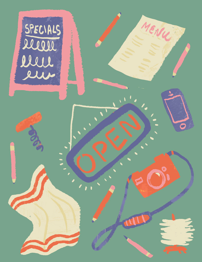
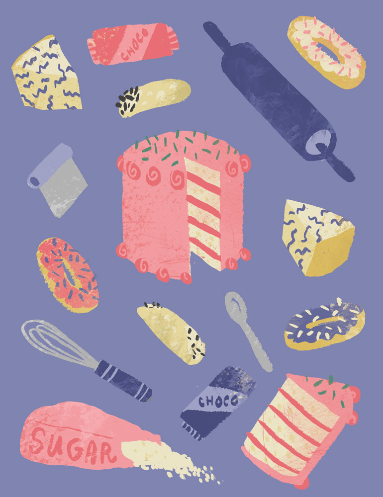
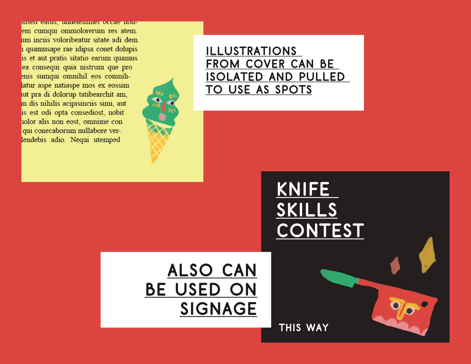
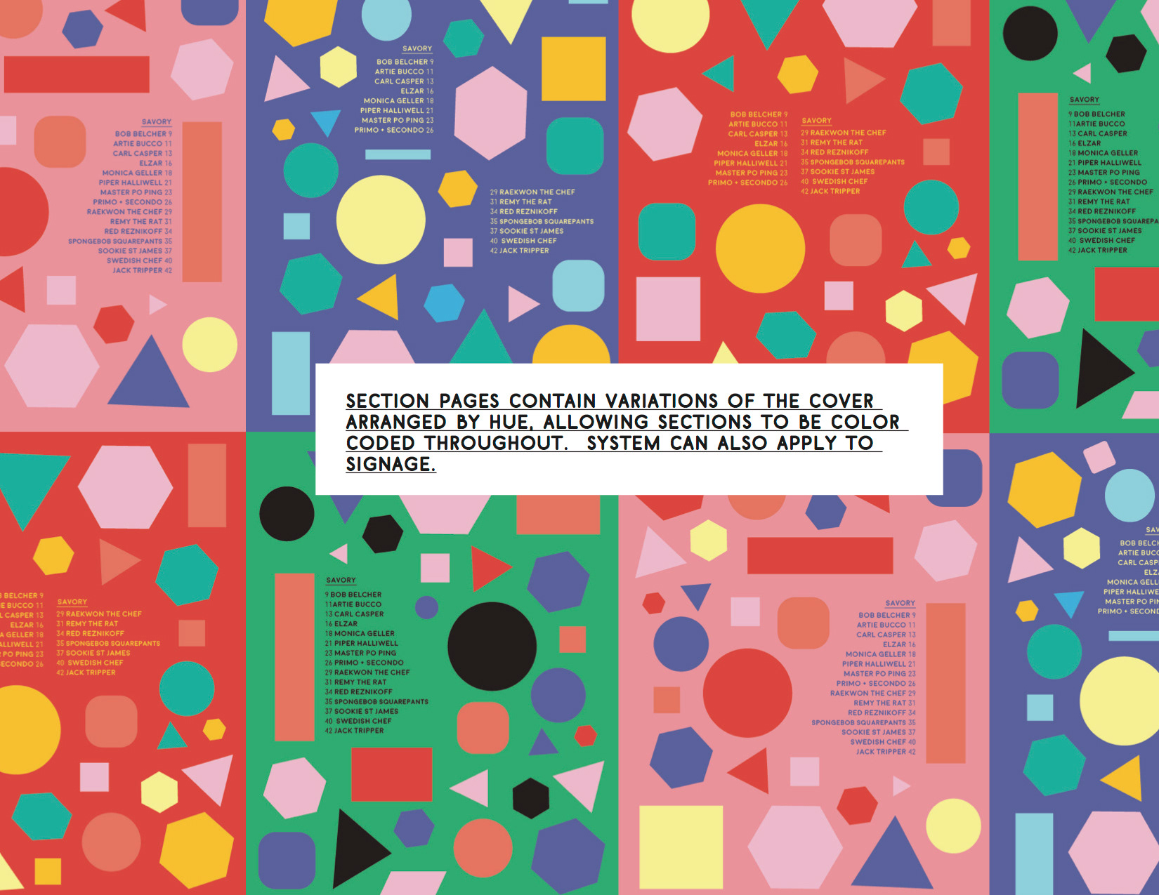
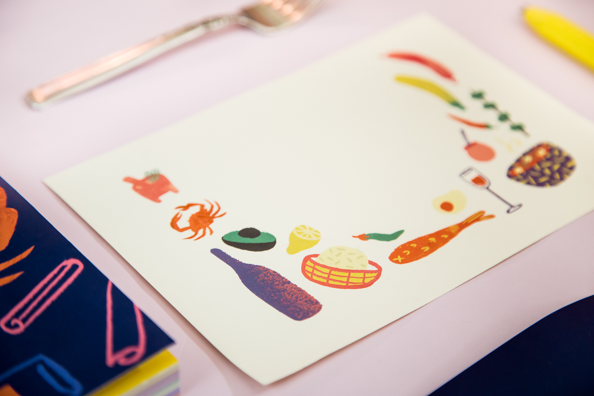
These illustration pages served as dividers for sections of the cookbook, which is separated in to categories based on the presenters the recipes came from. Each item on the page represents a specific presentation. These two pages lead the restauranteur/business and pastry sections, respectively.
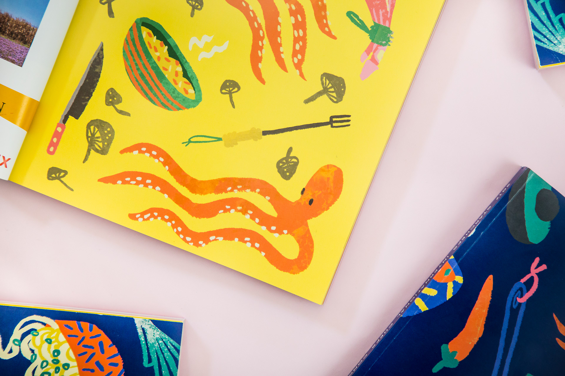
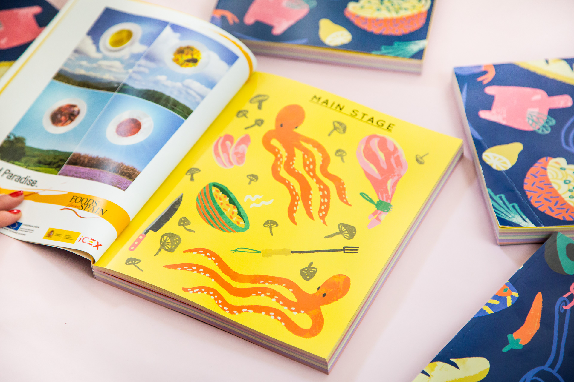
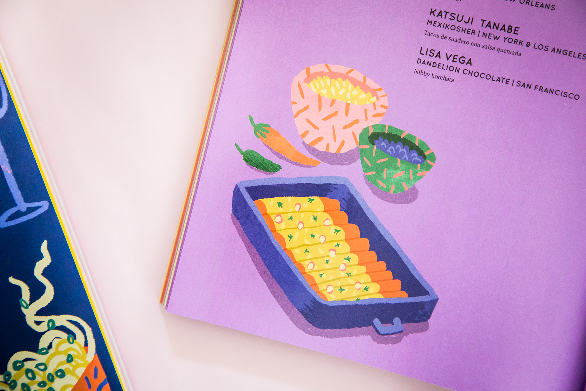
The book is largely funded by ad space. The bright background colors of the pages serve a dual function: to indicate sections of the book, and to differentiate content from ad pages.
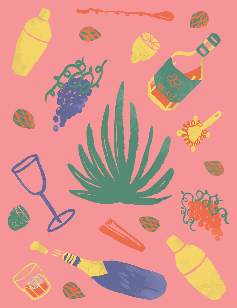
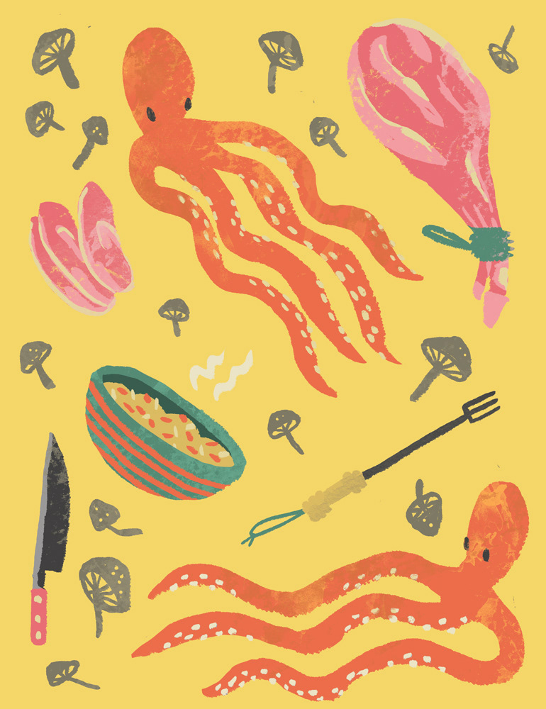
For the illustrations, I took inspiration from the folk art of various countries and regions including Mexico, Japan, and Scandinavia. I wanted them to look familiar and friendly but not tied to any specific culture or style.
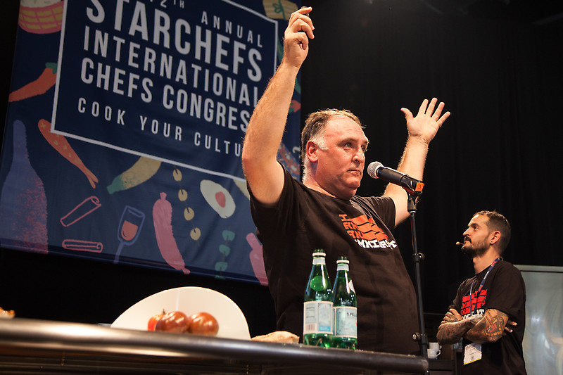
Illustrations on main stage signage (with chefs José Andrés and Aitor Lozano).

Designer/Production Artist: Beth Moeur
ICC cookbook editor: Caroline Hatchett
Photographs by Briana Balducci
Main stage photo courtesy StarChefs