I served as Creative Director on this fascinating project to rebrand and create an unconventional online experience for the estate of Hollywood photographer John R. Hamilton. Hamilton photographed stars from the 1940s through the 90s, with his career peaking as an on-set photographer shooting behind-the-scenes during the Golden Age of Hollywood. He was also known for his intimate portraits of celebrities from Clint Eastwood to Michael Jackson, often in their own homes, and his work on the set of Westerns through his relationships with John Ford and John Wayne. The custodians of his archive wanted to create an online exhibition of his work that could be used as a marketing tool to reach gallerists, publications, decorators, historians, and fans, wrapped in an elevated visual presentation that could attract fine art institutions. My team culled several fascinating collections of photos from his expansive archive, created a new visual identity that read as both refined and cinematic, and built an unconventional website with content as dramatic and engaging as his photographs. View the final site at johnhamiltoncollection.com.
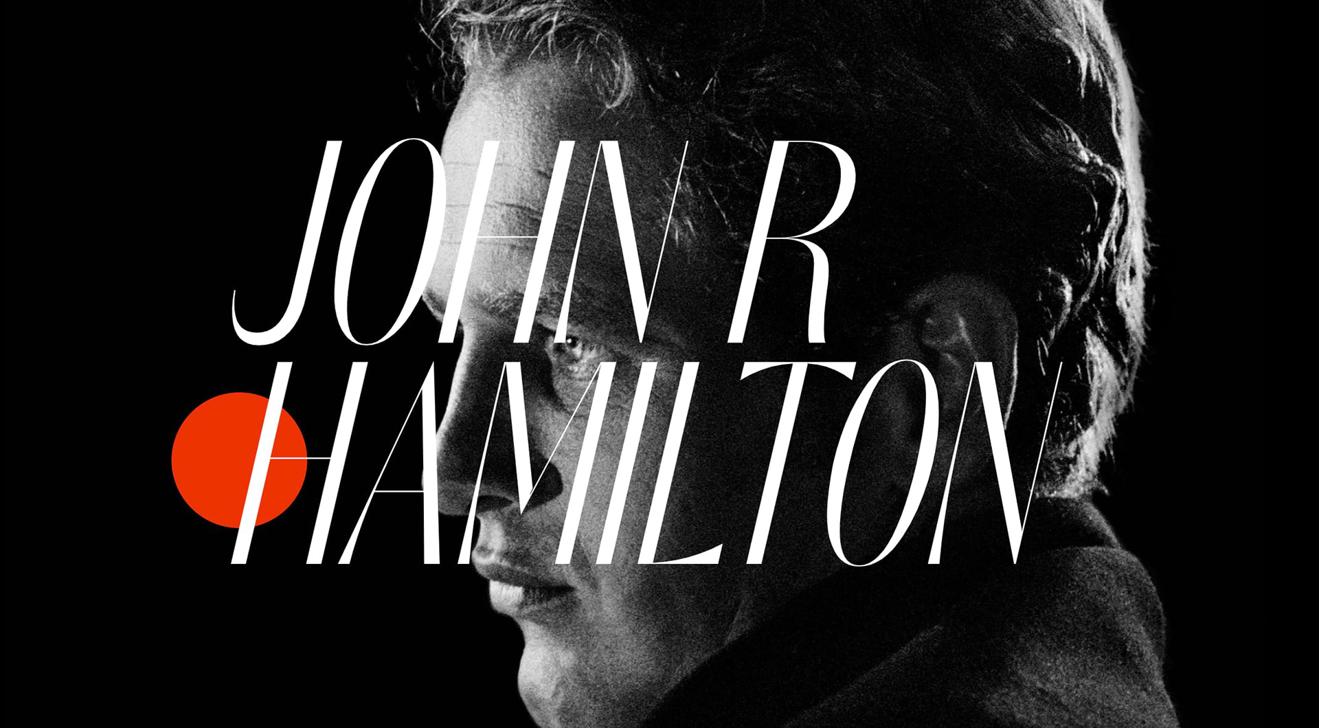
The main splash on the website, which uses parallax scrolling to reveal the image. Dramatic compositions inspired by movie posters were a focus of the branding.

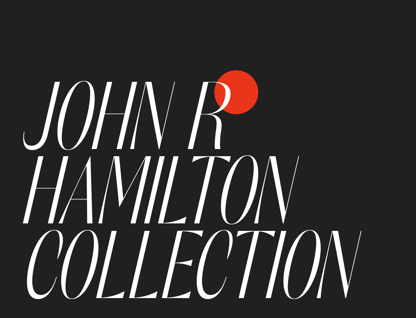
We chose to balance a pared-down aesthetic with a more complex font system. We looked for typefaces that were elegant, architectural, and could create interesting dynamics with each other and with Hamilton's photos.

Another parallax composition from the homepage. Most of Hamilton's photos were black and white, so we chose a color palette that would primarily compliment his film images, but was also simple enough to enhance his later color work.
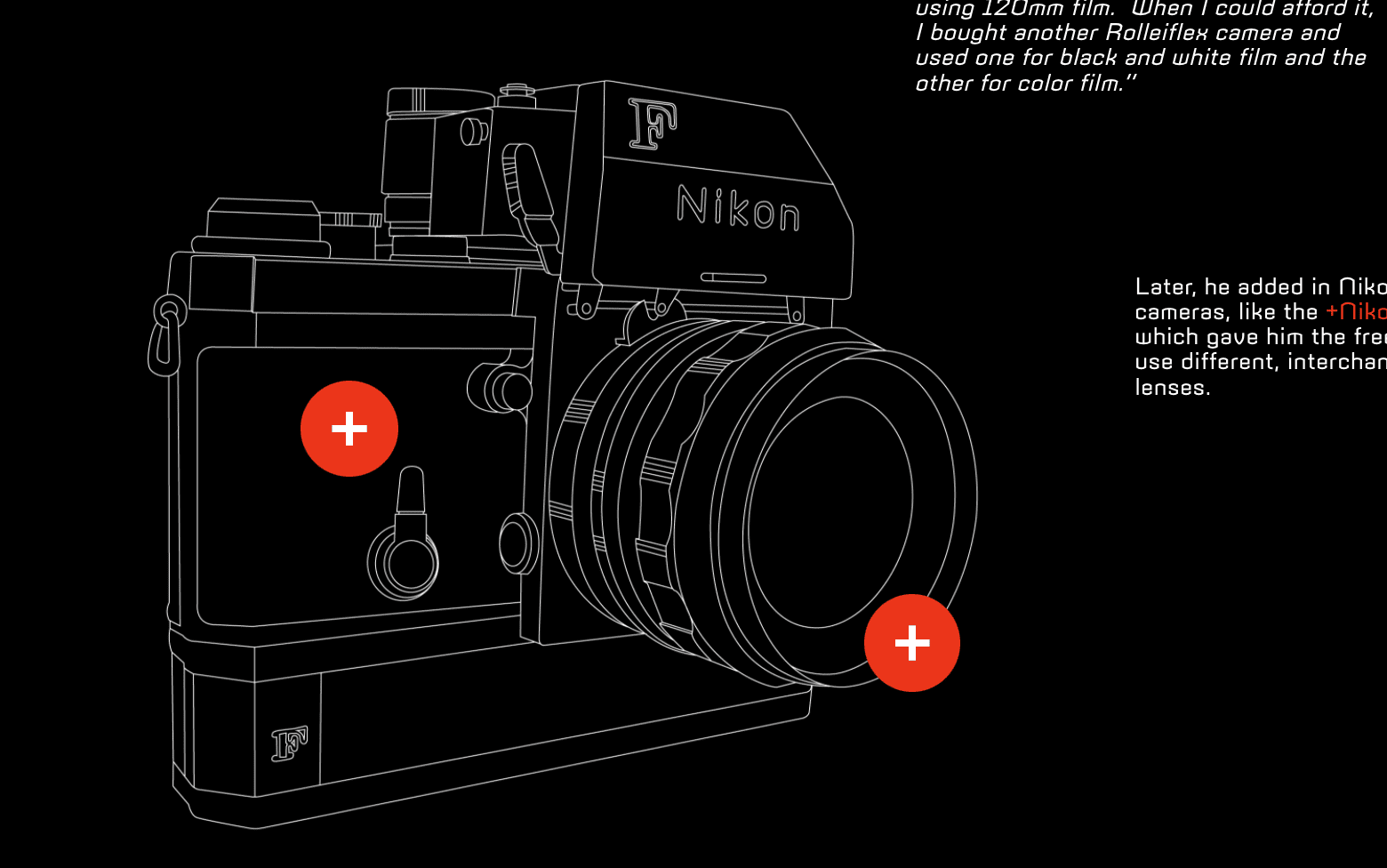
Custom illustrations contain hotspots that reveal more information about the cameras he used. This precise, fine-line illustration style is a nice contrast to his soft, grainy photographs.
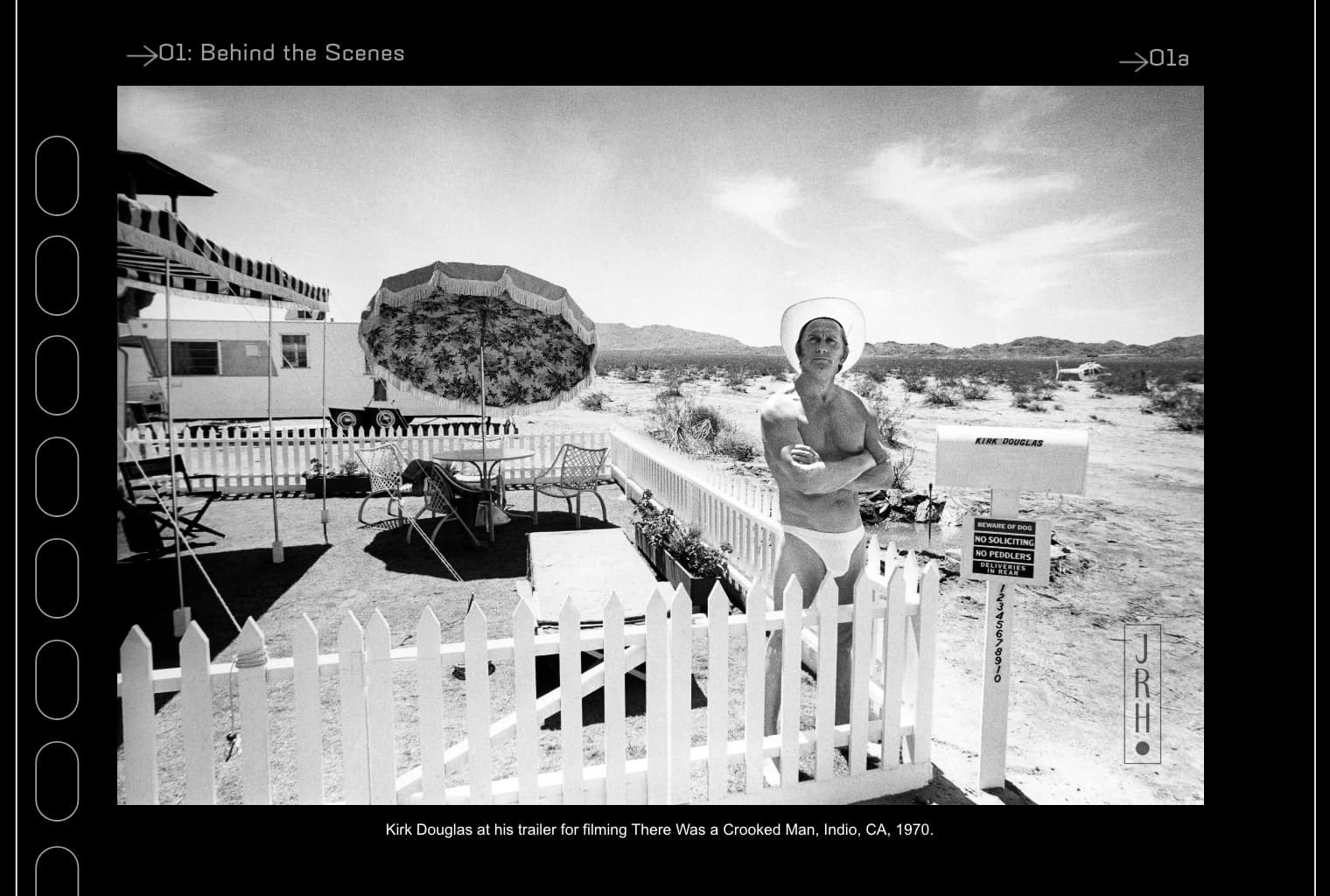
A favorite shot from the photo gallery. We curated different collections here to show the scope of his legacy: behind the scenes shots, a photo story on Russ Meyers, at-home celebrity portraits, his work on famous Westerns, and more. Much of the visual tropes were inspired by the photos we studied of his darkroom and studio; we tried to emulate the shapes of film strips, developing trays, camera lenses, and contact sheets throughout the site and brand.
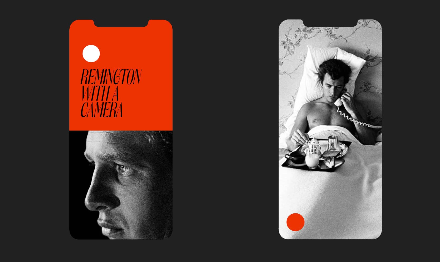
The mobile experience, playing even more with simplified shapes and layouts.
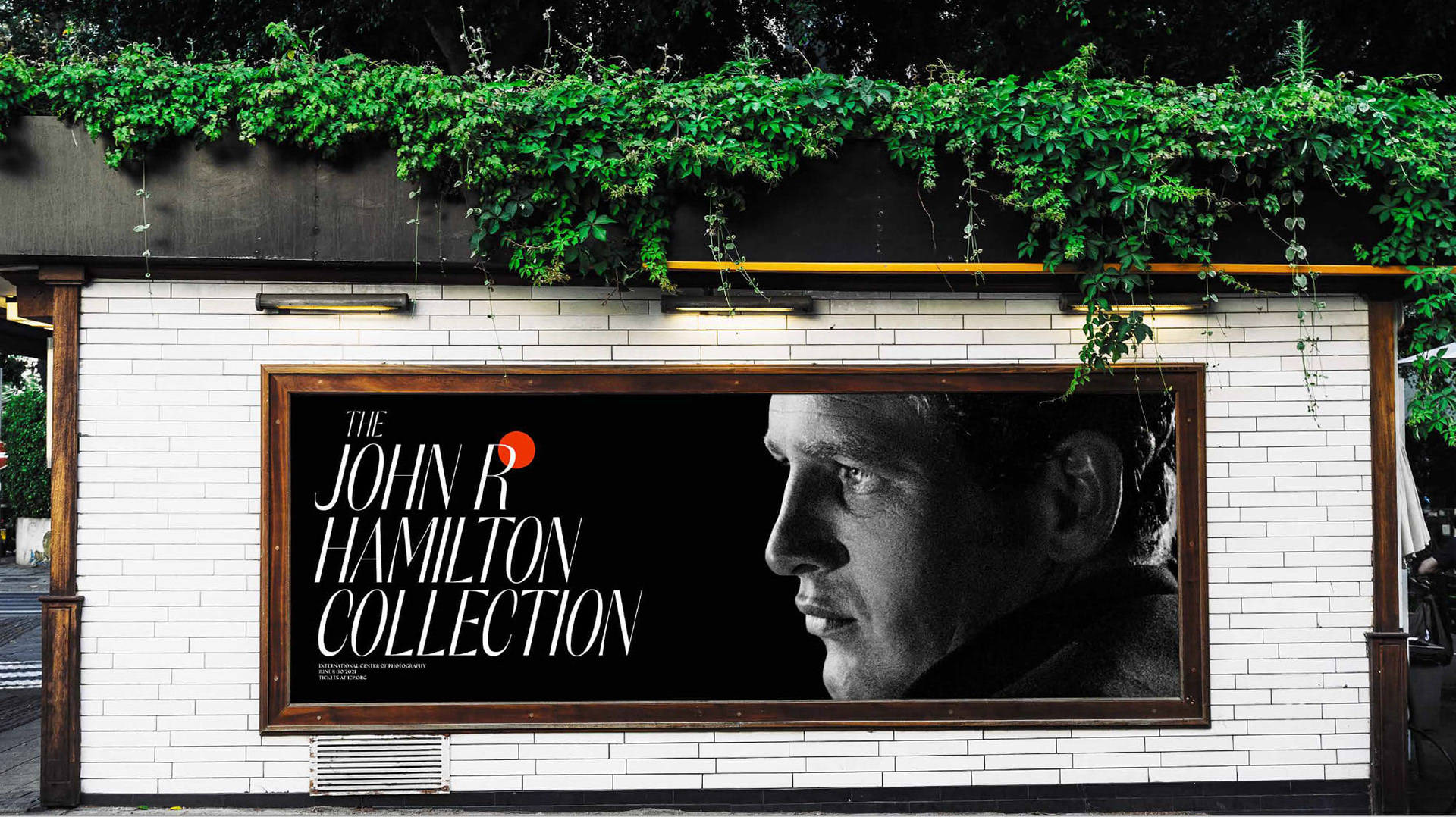
Some OOH. We aimed for the branding to be flexible, eye-catching, dramatic, and feel prestigious. We hoped that campaigns like this could sit comfortably amongst other blue-chip exhibit advertisements.
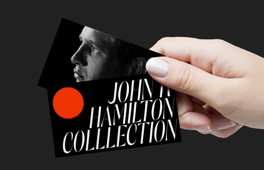
Business cards, which used a rotating set of photographs and logo treatments. The logo was built to be flexible and interchangeable, more of a set of guidelines around type, color, and integration of shapes.